



In This Article
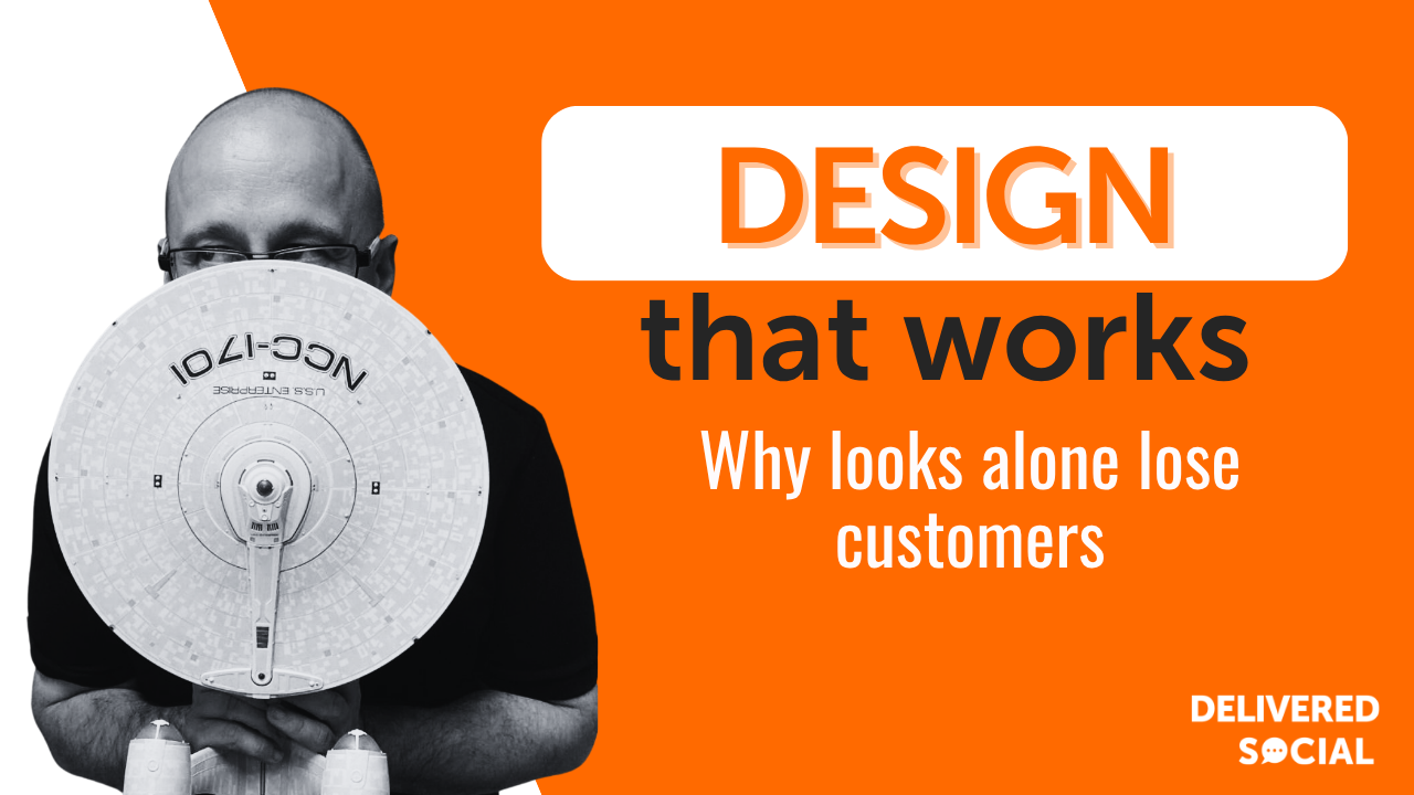
We have all fallen for something beautiful that turned out to be a nightmare to use. The gorgeous kettle with the handle that scalds your knuckles, the sleek website where you simply cannot find the contact button. That tension has a name, and it is one every business owner should understand: form over function. We say this to clients all the time: your website and your brand can be as striking as you like, but if they do not work for the person using them, all that beauty is quietly costing you customers.
In this guide we will unpack what form over function really means, why it trips up so many businesses, and how to strike the balance that keeps your design both lovely to look at and genuinely useful.
What form over function actually means
Form over function describes any design that prioritises how something looks over how well it works. The phrase is a deliberate inversion of the old design maxim that form should follow function, meaning the way something looks ought to be shaped by the job it needs to do. When form takes over, aesthetics win and usability loses.
Picture a restaurant menu printed in a wispy grey font on a pale background because it looks elegant. It photographs beautifully, but half the diners cannot read it in the candlelight. That is form over function in a nutshell: a choice that served the look and forgot the human being on the other side.
Why businesses fall into the trap
It is rarely carelessness. Most businesses drift towards form over function for understandable reasons, and spotting them is the first step to avoiding them. The pull is real, and it catches out even experienced teams.
Often it is a desire to stand out; a striking, unusual design feels braver than a clean and conventional one. Sometimes it is pride in the brand, where every element gets polished until it looks impressive but stops being practical. And frequently it is simply that the people designing it already know where everything is, so they never feel the friction a first-time visitor will hit immediately.
The real cost of prioritising looks over usability
When design gets in the way, the damage shows up in the numbers even when it is invisible to you. Here is where it hurts:
- Lost enquiries: if visitors cannot find your contact details or your buy button, they simply leave and try a competitor.
- Higher bounce rates: confusing layouts send people straight back to the search results within seconds.
- Frustrated customers: a fiddly checkout or an unreadable menu turns interest into irritation.
- Accessibility failures: low-contrast text and tiny buttons shut out people with visual or motor impairments.
- Weaker SEO: poor usability signals, such as quick exits, can drag your search visibility down over time.
How to balance form and function step by step
The goal is never to make things ugly; it is to make beauty and usability pull in the same direction. Here is the route we walk clients through:
- Start with the goal: decide what you want a visitor to do on each page before you think about how it looks.
- Design for the least confident user: if a first-time, distracted visitor can use it, everyone can.
- Keep the important things obvious: your contact button, your prices and your key message should never require a hunt.
- Test readability: check contrast, font size and spacing on a real phone in real light.
- Watch real people use it: observing even three people navigate your site reveals problems you are blind to.
- Refine, do not decorate: when in doubt, remove clutter rather than adding more visual flourish.
Do this and you end up with something that looks considered precisely because it works so smoothly.
Good design versus form over function
To make the difference concrete, here is how thoughtful design compares with design that has tipped too far towards looks:
- Navigation: good design makes it obvious; form over function hides it for the sake of a clean look.
- Text: good design is easy to read; form over function chases elegant fonts that strain the eyes.
- Buttons: good design makes them look clickable; form over function disguises them as decoration.
- Loading speed: good design stays fast; form over function piles on heavy visuals that slow everything down.
- Purpose: good design guides the visitor; form over function impresses them, then leaves them stuck.
Best practices for design that works and delights
Balancing the two is less about rules and more about habits. Always lead with the visitor’s task, and let the visual style support that task rather than compete with it. Embrace white space, because room to breathe makes a page both more attractive and easier to use. Make interactive elements look interactive, so nobody has to guess what is clickable. And treat accessibility as part of good design, not an afterthought; a site that works for everyone is simply a better site. Beauty and clarity are not enemies, and the best designs prove it every day.
Common mistakes we see business owners make
These are the slips that most often push a design over the edge:
- Chasing trends: adopting a fashionable style that looks current but confuses the people you serve.
- Hiding the call to action: making the most important button subtle because a bold one feels pushy.
- Overloading the homepage: trying to impress with everything at once and overwhelming the visitor.
- Skipping testing: assuming that because it makes sense to you, it makes sense to everyone.
- Prioritising the pitch over the customer: designing to win awards rather than to win business.
Where design thinking is heading next
The good news is that the industry is moving firmly back towards function-led design. Accessibility standards are tightening, search engines increasingly reward usability, and customers have less patience than ever for sites that waste their time. The most admired brands now win praise for being effortless to use, not just pretty, and that shift is only accelerating. For small businesses, the lesson is reassuring: you do not have to choose between looking good and working well, and the future belongs to those who deliver both.
Frequently asked questions
What does form over function mean?
It describes design that prioritises appearance over usability, so something looks impressive but is awkward or confusing to use. The healthier approach is to let form follow function, shaping the look around the job the design needs to do.
Is form over function always bad?
Not always; in pure art or a striking hero image, aesthetics can lead. But for anything a customer needs to use, such as a website or a menu, letting looks override usability almost always costs you.
How do I know if my website suffers from it?
Watch someone unfamiliar try to complete a task on it, such as contacting you or buying something. If they hesitate, squint or give up, form has probably crept ahead of function.
Can a website be both beautiful and functional?
Absolutely, and the best ones are. Beauty and usability work best together; clear layouts, readable text and obvious buttons can be every bit as elegant as they are effective.
Your quick form and function checklist
- Goal first: know what each page should help a visitor do.
- Obvious basics: keep contact, prices and key actions easy to find.
- Readable: check contrast and font size on a real phone.
- Clickable: make buttons look like buttons.
- Test: watch real people use it.
- Simplify: remove clutter before adding decoration.
Let us design something that works beautifully
Understanding form over function is really about respecting the person on the other side of the screen. Great design earns its keep by being a pleasure to look at and a breeze to use, and getting that balance right is exactly the kind of thing that turns visitors into customers. If your website looks the part but is not pulling its weight, that is where we come in. At Delivered Social we design websites and brands that are as effective as they are attractive. Get in touch with our team today and let us build something that works as hard as you do.
Share This Article
About the Author: Jonathan Bird































