


In This Article
Boosting conversions is a team sport. You need all of your players to actively participate and pull their own weight. Your website design, your content, and your optimization efforts all need to align to achieve the best results.
In this post, we’ll be looking at six strategies for designing your above-the-fold homepage section and how they can impact conversions.
Follow CTA Best Practices
In order to boost conversions, your hero section needs to contain at least one, but often more, quality CTAs. They are the most direct ways to influence visitor behavior, so ensuring they inspire the right kind of action is key.
Here’s what you need to know about creating quality CTAs:
- Be clear: you don’t want anything about your CTA to be confusing. What the action is and what it will result in should be perfectly clear.
- Use relevant action words: but don’t go overboard. You don’t need to sound too enthusiastic, but a well-chosen verb will come in handy.
- Make sure the CTA stands out and does not blend in with the rest of the page.
- Keep the CTA relevant to its placement: don’t ask leads to sign up to your newsletter right next to a product photo.
- Keep A/B testing different CTA variations.
Let’s look at an example. MarketBeat has several strategically placed CTAs above the fold. There’s a free trial CTA in the main menu and just below it. The first one is less noticeable, while the second one clearly stands out and demands attention. They also have a newsletter signup CTA above the fold, neatly stacked among other useful information.
This collection of CTAs makes it easy for a visitor to engage with the brand immediately. Plus, they’ve clearly highlighted their most valuable assets: the newsletter and the free trial.

Source: Marketbeat.com
State Your Value Proposition Clearly
Your value proposition is another important above-the-fold element you should carefully consider. A good value proposition will:
- address your audience’s pain point(s)
- clearly define what your solution is and what its benefits are
- establish a clear link between the pain points and your solutions
When you get it right, it will boost your conversions. People will only make a purchasing decision when they’re clear about what you are selling and how you differ from your competition.
This does not mean you need to reinvent the wheel. All you need to do is come up with a couple of sentences that define your value and your offer.
Let’s look at Vivion, which has three value propositions above the fold:

Source: Vivion.com
Each of them focuses on a different aspect of their business and clearly establishes them as a professional, experienced brand that offers high-quality products.
They address the most common conversion obstacles of their audience:
- They highlight that their products are designed for everyday use and thus appeal to a wider audience.
- They emphasize that their products are safe and ethically sourced, which may not be the case with all of their competitors.
- They note that they have a team of experts ready to help customers make the right choice.
When combined, these simple statements clearly set them apart in an industry that can be very competitive.
Provide Access to Key Functionality
The best way to convert someone is often to let them try the product as soon as possible. After all, the product will speak for itself best. If it’s not working well or if it’s just not what a specific customer is looking for, better to know that sooner than later.
This tactic will work for digital products, which are able to provide demos or partial access to their core features. Physical products can be demoed with a video, but the effect won’t be the same.
How you choose to provide access will be up to you and the nature of your product. Placing it above the fold is a great way to instantly capture your audience’s attention and ensure they don’t venture somewhere else.
UnscrambleX does this very effectively. They have placed their word unscrambler above the fold on all of their pages, not just their homepage. It is literally the first thing you see when you come to the website, and you instantly want to try it, too.
This is a great tactic for boosting both engagement and conversions, as they’re able to demonstrate value and expertise right off the bat. They don’t have to spend too much time convincing visitors to give the product a try. It’s right there; they won’t be able to resist.
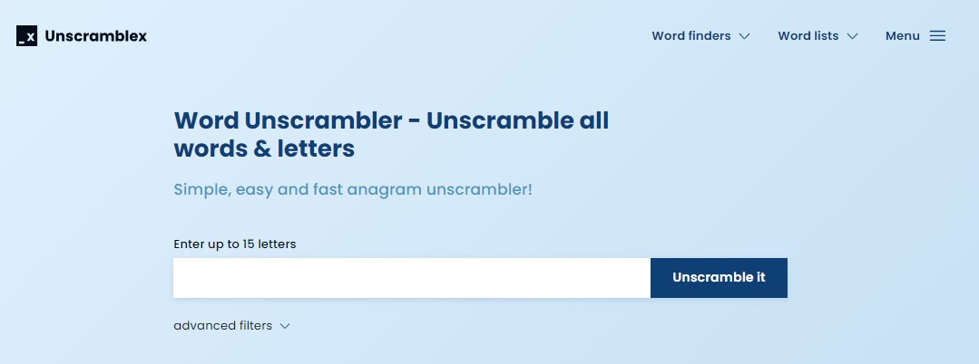
Source: Unscramblex.com
Demo the Product
You can use a similar tactic without actually providing access to your product but instead providing access to a detailed product demonstration. While you won’t be able to show all of its features, you don’t even need to. Your goal here is to capture the attention of your audience and get them interested enough to learn more.
The best way to do this is to focus on a specific pain point your audience has (or several of them) and practically demonstrate how your solution will solve them. This tactic will work for both digital and physical products, as you’re able to show your product in action in both cases.
Don’t overwhelm your visitors with too much information. They are likely to seek out a simpler solution or one that demands less of their attention. Instead, explain the value and benefits of your product clearly and in terms they are likely to understand.
Overflow did a really good job with their product demo. They have an auto-play video above the fold of their homepage, which shows what the product looks like, how it can be used, which problems it solves, and why this matters.
They also give you the option to watch the entire video at your own pace, pausing it or skipping to the parts you’re actually interested in.
Source: Overflow.io
Feature a (Product) Carousel
If you want to capture your audience’s attention with more than one product or you want to appeal to different segments of your audience, you can do so with a product carousel in your hero section.
This solution will circumvent any issues you may have with indecision. For example, if you have recently launched several new products, you won’t have to choose just one to make the most prominent. If you want to show that you work both with individuals and businesses, you can make this clear with several value propositions and several images.
The key is to make sure the carousel spins at just the right intervals. You don’t want it to be too fast, as that will annoy visitors who haven’t had enough time to see the first image. On the other hand, if you make it too slow, it will morph into a static hero image rather than a carousel.
A/B test what rotation times work best. Make it very clear that there is more than one image or product to be seen. Also make sure that each image stands out and is clearly referencing a different product.
Juvia’s Place does a good job on their homepage, featuring five collections in their carousel. It moves just slowly enough for you to take a good look at the product, choose if you want to click, or wait for the next slide. It’s also perfectly clear that you can spin it yourself and see what else the brand has on offer.

Source: Juviasplace.com
Highlight Key Trust Signals
Finally, you also want to make sure you include the most relevant trust signals above the fold. Depending on what the most common conversion obstacles in your industry are, you’ll want to address different points.
This is your way of telling your visitors that you understand what they’re looking for and what their concerns are. They’ll see that you’ve taken the time to provide the best service possible.
Take a look at Lords and Labradors, for example:
- They tell you that they offer free delivery above a certain threshold. That’s great to know before you start looking at their collection, and not after.
- They tell you their products are made in Great Britain, so you know you’re supporting a local business.
- They tell you they have a loyalty program.
- They give you a contact number.
For their customers, these trust signals make the most sense. You will need to figure out what your audience would like to learn right off the bat and highlight those aspects of your business.
Consider things like shipping costs, returns policies, contact information, or any awards you may have won. You can also highlight how many reviews you have, how many customers you’ve worked with, or any other important and relevant fact.
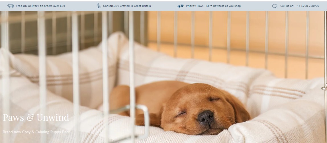
Source: Lordsandlabradors.co.uk
Wrapping Up
Consider these six above-the-fold design tips to improve your conversion rates. Don’t forget to first take some time to analyse your target audience and what they might be looking for to ensure your design efforts align with their needs.


