


In This Article

Most social media content fails not because of poor ideas, but because of poor design thinking. The same problems that hurt websites, such as cluttered layouts, unclear priorities, slow-loading visuals, and no obvious next step, show up constantly in social posts that audiences scroll straight past.
London web design has long operated under pressure to perform. Sites built for competitive markets in one of the world’s most digitally active cities are optimised around one thing: getting users to act before they leave. That discipline, rooted in user experience and conversion optimisation, translates directly to social content strategy in ways most creators overlook.
The core lessons centre on a handful of principles: designing for attention rather than decoration, treating mobile readability as non-negotiable, reducing friction between the message and the desired response, and building content with a single priority action in mind. These are the same principles Google rewards in web UX, and they are just as relevant when someone decides in half a second whether to stop scrolling. The sections that follow unpack each of these principles and show how content strategy improves when it borrows from web design thinking.
Clarity and Hierarchy Win Attention Fastest
Attention on social media is not lost to bad content alone. It is lost to visual noise, competing elements, and layouts that force the eye to work harder than it should. Web designers have understood this for years, and their approach to hierarchy and simplicity carries direct lessons for social content.
Apply Visual Hierarchy to Feeds and Carousels
Visual hierarchy on a web page determines what a visitor reads first, second, and third. The same logic applies to a social tile or carousel slide. Scale signals importance, contrast draws the eye, and spacing creates breathing room that makes every element feel intentional rather than crowded.
In a carousel, sequencing matters as much as individual slide design. The first frame needs to earn the swipe, just as a headline earns a click. The strongest creative agency principles treat each frame as a step in a deliberate flow, not a collection of independent graphics stitched together.
Captions and thumbnails follow the same rules. A thumbnail with one dominant visual element and strong contrast consistently outperforms a busy design, regardless of how polished the latter looks.
Use Minimalist Design to Sharpen the Message
Minimalist design is often mistaken for a stylistic preference. In UX terms, however, it is a functional choice. Removing unnecessary elements reduces cognitive load, which means the main message reaches the viewer faster and with less resistance.
A London web design agency working on high-converting pages will strip layouts down to what the user needs at that moment. That same editorial discipline, applied consistently across digital touchpoints, is what allows both websites and social assets to communicate with clarity and build trust quickly. Applied to social content, it removes decorative clutter that dilutes the core idea.
This approach ties directly to content strategy. Cleaner design does not just look better; it produces measurably stronger engagement because the audience is not left deciding what to focus on. That decision has already been made for them.
Design Every Post for the Mobile-First Scroll
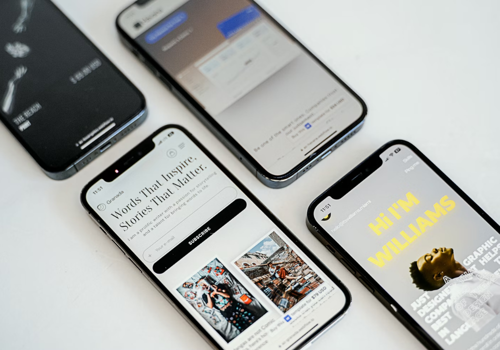
Mobile-first design is not a web-only consideration. The majority of social media consumption happens on phones, in portrait orientation, with a thumb moving faster than most content can catch it.
The vertical formats that define modern social, including stories, reels, and vertical carousels, were built specifically around this behaviour. Responsive design thinking, which web professionals apply to ensure layouts adapt cleanly across screen sizes, becomes something more specific on social: platform-aware composition. That means knowing where text sits safely, how much copy fits before the eye gives up, and which visual elements survive compression on a small screen.
Build for Vertical Viewing and Fast Decisions
London web design teams routinely design around safe zones and viewport constraints, ensuring nothing important gets cropped or buried. The same principle applies directly to social content. Text placed too high or too low risks disappearing behind interface elements, and a headline that fits beautifully on desktop may wrap awkwardly on a 375-pixel screen.
Text density is one of the most common drop-off triggers on mobile. When a slide or frame carries too many words, the viewer does not slow down to read them. They scroll past.
Pacing matters just as much as layout. In a carousel or reel, the rate at which information is revealed affects completion rates. UX research consistently shows that reducing friction and cognitive load at each step keeps users moving forward rather than exiting early.
Applying mobile-first user experience thinking to social content is not about aesthetics. It is about giving every post a real chance of being seen, read, and acted on before the scroll moves on.
Good Social UX Removes Friction and Builds Trust
The decisions that shape user experience on a well-built website are rarely decorative. Contrast ratios, button sizing, motion design, and overlay placement all exist to reduce the effort required from the viewer. On social media, the same principle applies, and the brands that treat these as usability choices rather than creative ones consistently produce content that is easier to consume and easier to act on.
Trust, in both web and social contexts, is built through consistency. When patterns repeat across posts, from typography choices to how interactive elements behave, the audience develops a sense of familiarity that lowers resistance and reduces cognitive load before they have consciously registered why.
Accessibility Improves Reach as Well as Usability
Accessibility in web design addresses a wide range of user needs, and each consideration carries over to social content. Strong contrast between text and background ensures readability across lighting conditions. Alt text on images supports screen readers and also improves discoverability through platform indexing. Captions on video are not optional extras; a significant proportion of social video is watched without sound, making captioning a direct engagement decision.
Readable typography, appropriate font sizing, and avoiding motion that could cause discomfort are all inclusive design choices that simultaneously expand reach. Designing for access is, in practice, designing for more people.
Micro-Interactions Can Guide Action Without Clutter
Micro-interactions are the small, functional cues that signal progress, invite response, or confirm an action. In responsive design, they appear as hover states, loading indicators, and animated transitions. On social, the equivalent includes motion that draws the eye to a key element, subtle animation that separates sections in a carousel, or a visual prompt that nudges the viewer toward the next frame.
Used with restraint, these cues guide behaviour without adding visual noise. They work precisely because they do not demand attention; they simply make the next step feel obvious.
Use Web-Style Measurement to Improve Social Output
Good design decisions are not just intuitive; they are measurable. The same data-driven mindset that shapes high-performing websites can be applied to social content, and the results are just as instructive.
From Core Web Vitals to Attention Metrics
Data-driven design is built on a straightforward principle: test creative assumptions against actual behaviour rather than guessing what works. Google developed official documentation around Core Web Vitals to measure exactly this, tracking how quickly pages load, how stable layouts remain, and how fast content becomes interactive.
These same dimensions map cleanly onto social performance. Load time on web translates to how quickly a visual registers on a small screen. Attention metrics replace dwell time. Interaction rates mirror click-through behaviour. Completion rates, whether a user finishes a reel or reads through a carousel, reflect the same engagement signal that session depth provides on a website.
Conversion optimisation thinking extends this further. On a landing page, every element is evaluated against whether it moves the visitor closer to an action. Profile clicks, lead form completions, and link taps in social content are equivalent checkpoints. A content strategy built around these markers improves by the same logic: remove what adds friction, sharpen what drives action, and measure what changes.
Iterative improvement matters more than trend-following here. Optimising your social presence means returning to the data after each content cycle, identifying what held attention and what lost it, and adjusting accordingly. Chasing formats is not a strategy; building evidence is.
FAQs
How Can Web Design Principles Improve Social Media Performance?
Web design principles improve social media performance by applying the same logic used to keep website visitors engaged. Visual hierarchy, minimalist layouts, and clear content priorities all reduce cognitive load, which means audiences process the message faster and are more likely to respond to it.
Why Does Mobile-First Design Matter for Social Media?
Mobile-first design matters because the majority of social media consumption happens on phones. Applying mobile-first thinking ensures text, visuals, and layout choices hold up on small screens, where attention is shortest and user experience decisions have the greatest impact on whether content gets seen or scrolled past.
What Web Design Lessons Are Most Useful for Social Media Strategy?
The most transferable lessons involve hierarchy, simplicity, and friction reduction. Treating each post with the same content strategy discipline used on a landing page, prioritising one clear action, removing visual clutter, and designing for the context in which the content will actually be consumed, consistently produces stronger results.
What to Take from London into Your Social Strategy
The principles covered throughout this article are not new ideas. They are the same disciplines that London web design practitioners have applied to high-pressure, high-competition digital environments for years. What changes is the context in which they are applied.
UX thinking, content strategy, and conversion optimisation do not belong exclusively to websites. They belong to any environment where a person makes a fast decision about whether to keep engaging or move on. Social media is exactly that environment.
The practical takeaway is straightforward. Stronger social performance follows from the same decisions that produce stronger web performance: clearer hierarchy, reduced friction, mobile-aware composition, and content built around a single measurable outcome. Apply those consistently, and the results follow.


