


In This Article
77% of marketers claim that interactive content is not only highly reusable but also helps boost exposure, traffic, and engagement. Since it’s twice as engaging as static content, it can be your direct route to achieving this year’s marketing goals.
However, these statistics are only applicable if you do it right. If you don’t, you can’t expect to see the same results.
Here are six examples of brands that have made it work and how they’ve done it. Hopefully, you can create something in the same interactive category and boost your conversion and retention rates.
[code_snippet id=5]Self-Assessment Quizzes: Eachnight
People love online quizzes. They help pass the time of day; they are fun, quick, and they often provide interesting insight into the way the mind of the quiz-taker works. Just think of all those Buzzfeed quizzes you’ve taken over the years.
As a brand, of course, you’re going to think differently. Using quizzes for marketing means finding an angle that allows you to promote your product.
Your ultimate goal is to help your leads learn something or choose something. Maybe they need a hand choosing the right type of product for their needs? Or maybe they want to know how much something would cost or how long it would take?
This Choose the Right Mattress Quiz from Eachnight is a good example of a brand getting it right. It helps you select the right product based on your sleeping style and needs. The user interface is very simple, you know how many questions are left, and the simple icons make the quiz more visually appealing as well.
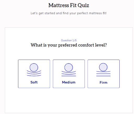
Image source: Eachnight.com
What makes it even better is the fact that it was made by a doctor, and the FAQs at the bottom help you get some additional answers.
Calculators: MarketBeat
Online calculators are another amazing piece of interactive content you can offer your visitors. The more complex the process of calculation, the more appreciated your solution will be.
You usually see calculators in the finance and health niches, but real estate and home improvement have great use for them too.Let’s take a look at this calculator for dividends to see what a good solution looks like. It has many, many fields, which helps provide reassurance. Given the topic, you need a lot of variables.
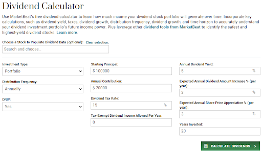
Image source: Marketbeat.com
The preselected values in the fields make the process feel less overwhelming and significantly boost user experience. The clickable arrows also make changing variables easy without a keyboard.
The biggest selling point of this calculator is that it is not gated. You see your results instantly, and you don’t need to provide any personal information. A huge bonus for the brand for making such a valuable asset completely free.
They’ve also managed to present very complex data in a simple-to-understand manner. The interactive graph is of huge help, and the results are easy to understand too.
Reference Tools: UnscrambleX
Reference tools are designed to accompany a certain activity. For example, you can create an interactive encyclopedia of different kinds of butterflies, plants, or dogs. You could create an interactive timeline of certain events.
Or, you can create a tool for puzzle enthusiasts, like our example brand here. Their anagram solver encapsulates what this type of resource should be. As there is a parallel activity going on (in this case, a game), the tool must be very simple to use, with no visual clutter and no unnecessary or forced interactions.

Image source: Unscramblex.com
The input field is very big and there are no distractions around it. While there are plenty of advanced filters, they are hidden until you need them. When they do pop out, they don’t overwhelm the interface.
The way the results are displayed is also commendable. They are categorized in a meaningful way, give the context of the activity at hand, and they’re easy to sift through.
Interactive Infographics: Optum
Infographics are an excellent way to simplify the presentation of complex data. They are shareable and can drive a lot of traffic, especially if you can make them interactive and find a subject matter your target audience is genuinely interested in.
Take a look at this infographic called A tobacco user’s tech-enabled journey. It was designed to fit on a laptop screen, so there is no scrolling required to engage with it. You can simply use your mouse to interact, not to navigate.
Image source: Optum.com
You can also download the infographic, so you’ll be able to turn it into an offline presentation or easily share it with others over email. You don’t have to access the website again.
The key takeaway here should be the ease of access the infographic provides, as well as the simple yet effective design.
Data Visualization: Podio
There are other ways to help your audience digest complex information other than the infographic: timelines, pie charts, tables, and graphs. Depending on the type of data, you can find very different ways to present it.
This timeline of the daily routines of famous people is a good example. It ties in with the brand’s product very well, and it can give their audience interesting insight into how other creatives structure their day. It’s not something you would otherwise learn about.
The way the data is presented is simple and very on-point. The publisher is aware of the fact that the purpose of their data is mostly to entertain their audience. This has informed the data they’ve chosen to present and the way they package it.
There are no unnecessary pieces of information, nor is there too much branding. The graph will likely earn plenty of shares, but its aim is not so much to raise brand awareness or to convert visitors as to provide a fun break and get readers thinking.
Dynamic Whitepapers: Netapp
Whitepapers are another tried and trusted content format that a lot of brands use to boost their conversion rates. But when they are dynamic and interactive, they have a much higher chance of boosting engagement rates and attention spans.
This whitepaper on designing the next generation data center is a good example. However, it’s gated, so you won’t be able to view it without a registered account.
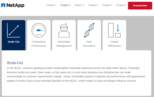
Image source: Netapp.com
What it does right is ensuring that readers stay engaged despite the plethora of information. It also uses a video, so different audience segments can enjoy the whitepaper in their preferred medium.
The design itself is excellent. The clickable areas are large, even oversized. They have avoided a typical table of contents (which is nothing but a wall of text), making it much more engaging.
The amount of information shown on screen at any given time is limited. The purpose of the infographic is to help the reader engage with a reasonable amount of content without getting overwhelmed or losing focus.
It’s also downloadable, so that’s another bonus for the brand. Given the quality of the content, it makes sense to gate the information and leverage the infographic for lead generation.
[code_snippet id=6]Wrapping Up
Hopefully, these six examples have illustrated how you can create your own interactive content that will be just as interesting and engaging for your audience base. Don’t forget: in order for it to serve its purpose, it needs to excel at design, interactivity, and value.


