Google has quietly rolled out a visual update to its well-known “G” icon, catching the attention of designers, marketers, and everyday users alike. While the change may seem subtle at first glance, it forms part of a larger design strategy aimed at keeping the brand fresh, accessible, and consistent across all platforms. This latest Google G logo Update shows how even the smallest visual adjustments can carry significant weight for a company with billions of daily users.
In the world of tech branding, visual identity is no longer just about logos and colour schemes. It’s about how every element of a brand works together across devices, screen sizes, and user journeys. For example, Brandmydispo, a custom packaging manufacturer, applies the same principles of cohesive branding and design consistency across every physical package they produce, ensuring that a company’s identity remains unified both online and offline. Google’s recent move is not just cosmetic. It reflects a growing trend among global tech companies to refine their branding in ways that feel more cohesive and modern, without losing recognition or user trust.
This article takes a closer look at what’s changed in the Google logo redesign, why it matters, and what it signals about wider design trends in 2025. Whether you’re in marketing, design, or simply curious about the evolution of digital brands, there’s more to this update than meets the eye.
What’s Actually Changed?
At first glance, the changes to Google’s “G” logo might seem barely noticeable. But in design, the smallest tweaks often carry the biggest impact. The Google G logo Update focuses on refinement rather than reinvention. It’s all about sharpening the existing look to improve clarity, accessibility, and consistency across platforms.
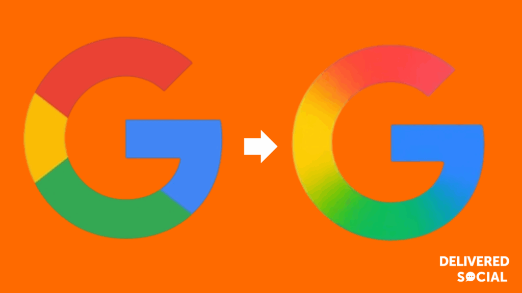
The most obvious change is the colour gradient. In the new version, the colours are slightly bolder and more balanced. The reds and blues appear a touch deeper, while the yellow and green feel better integrated. This helps the logo stand out more clearly, especially at smaller sizes, which is crucial for mobile-first platforms and app icons.
Shape-wise, the “G” itself has been subtly adjusted. The curves feel slightly tighter, and the transitions between colours are cleaner. These refinements make the icon feel more polished and modern, while still retaining the playful, multi-coloured identity that users immediately recognise as Google.
This Google logo redesign also addresses consistency across devices. Whether you’re on Android, iOS, Chrome, or Gmail, the updated icon now appears more uniform in both colour rendering and placement. The redesign ensures that the “G” feels at home on high-resolution displays, dark mode interfaces, and across Google’s growing suite of products.
Rather than introducing a radical new look, Google has opted to enhance its existing identity through small, thoughtful changes. It’s a reminder that successful branding isn’t always about bold moves – sometimes, it’s about getting the details just right.
The Reason Behind the Redesign
Google has always prioritised clarity and simplicity in its design choices. The latest Google G logo Update builds on this approach by introducing subtle yet purposeful adjustments. This is not a dramatic rebrand. It is part of a broader effort to improve consistency, accessibility, and visual balance across Google’s ecosystem.
At the heart of this change is a commitment to modernisation. As digital interfaces evolve and user expectations shift, brands need to stay visually current without losing their identity. The Google brand refresh reflects this goal. By refining the shape, colour balance, and scale of the “G” icon, Google is improving how its branding functions in modern environments, particularly on high-resolution and mobile screens.
Accessibility is also a factor. The updated colours and smoother gradients are designed to be clearer and more readable for users with visual impairments. This aligns with Google’s broader mission to create inclusive digital experiences.
The redesign fits neatly into a wider Google visual identity update. In recent years, Google has unified its design language across products, apps, and platforms. From Workspace icons to system-level UI updates, there has been a steady push for visual consistency. The refreshed G icon supports that direction, offering a more coherent look across all touchpoints.
This change shows that even a small shift in visual design can reflect deeper thinking around brand clarity, function, and user trust. It is not about making a splash. It is about keeping the brand strong, clear, and ready for what comes next.
Why Subtle Logo Tweaks Matter
In the fast-moving world of digital branding, subtlety often carries more weight than bold reinvention. The Google logo redesign may look minor at first, but changes like this matter, particularly for a global brand with enormous reach.
Small visual adjustments help a logo work better across different platforms and contexts. The refined colour transitions, tighter curves, and improved contrast are not just aesthetic choices. They support better visibility, stronger recognition, and a more polished experience for users engaging with the brand on everything from smartphones to smart TVs.
When updates like this are rolled out, consistency becomes the priority. Every version of the icon, on every device and app, needs to feel unified. This is the core of a well-executed logo refresh strategy. It ensures that wherever someone interacts with the brand, they receive the same visual message.
The updated Google logo meaning is not about a shift in identity. It is about refinement. It reflects a company that values detail and understands the long-term impact of visual design. These types of tweaks, while easy to miss, help brands stay fresh and familiar at the same time.
This level of attention to detail shows why even the smallest design decisions deserve serious thought.
Public Reaction to Google G logo Update and Industry Commentary
As expected, the Google logo redesign has generated a mix of curiosity, approval, and design analysis across the internet. Although the changes are subtle, they did not go unnoticed. Designers, tech blogs, and everyday users have weighed in, offering their thoughts on the refreshed look.
The Verge described the update as a “tiny change with a big footprint,” noting that the more refined gradient and better visual balance make the icon easier to read at smaller sizes. 9to5Google pointed out that the update brings more harmony across Google’s platforms, especially where app icons sit side by side. Meanwhile, LinkedIn News highlighted how the change aligns with current modern logo trends, where minimal tweaks are used to refresh without disrupting recognition.
Some users on social media praised the shift, calling it cleaner and more polished. Others admitted they barely noticed the difference at first, but appreciated the improved clarity once compared side by side.
The redesign has also sparked conversation around flat design vs gradient styles, with some seeing it as a move away from overly flat visuals toward more dimensional, accessible branding. Overall, the reaction has been largely positive, showing that thoughtful design updates can succeed without fanfare.
Google’s Place in 2025 Branding Trends
The Google logo redesign is not just a one-off change. It fits into a broader set of trends that are shaping tech branding in 2025. In a space where companies compete for attention on ever smaller screens, brand clarity and design consistency have become more important than ever.
One of the most noticeable trends is the return of subtle gradients and softened detail. After years of extreme minimalism, many companies are finding a balance between simplicity and depth. Google’s refreshed “G” icon embraces this idea, combining a clean design with a more refined gradient that adds a sense of warmth and approachability.
Accessibility is another key focus this year. As user interfaces become more inclusive, logos and icons need to meet higher visual standards. The updated colours and smoother curves in Google’s icon support better legibility across different screen types and viewing conditions. This aligns with broader tech branding trends 2025, where usability and design are increasingly intertwined.
Other tech giants are moving in similar directions. Apple has gradually softened its iconography, while Meta has refined its visual language across apps to promote consistency. These shifts show that design updates are not about chasing attention, but about aligning with how people interact with brands daily.
Google’s decision to take a light but thoughtful approach shows its understanding of long-term brand building. The new icon might seem small, but it reflects a wider commitment to design that feels modern, accessible, and ready for the next phase of digital life.
What This Means for Google’s Future
The Google logo redesign is more than a minor adjustment. It reflects how the company is thinking ahead about its long-term identity across an expanding digital landscape. As users interact with Google on a wider range of devices and platforms, maintaining visual clarity has become more important than ever.
This change suggests that Google is focused on future-proofing its brand identity. Rather than overhauling its look with each trend, the company continues to evolve its visuals in a way that supports usability and consistency. For a global brand, this steady approach ensures users always feel familiar with what they are seeing, regardless of where they see it.
There is also a strong link to Google’s wider product design. As apps like Gmail, Calendar, and Drive become more integrated, consistent visuals help create a smoother experience. It is likely we will see more updates tied to broader Google interface design efforts and UI branding updates in the months ahead.
This logo refinement, while simple on the surface, reflects a deeper focus on design that scales, adapts, and aligns across products. It shows that Google is thinking not just about how it looks today, but how it will feel in the future.
Final Note
The Google logo redesign is a reminder that small details can have a big impact. It may not be a dramatic change, but it plays an important role in keeping the brand modern, clear, and user-friendly.
Google’s decision to refine rather than rework its identity reflects a focus on clarity and consistency across all platforms. These updates are not about being noticed. They are about strengthening recognition, improving accessibility, and supporting the way people interact with technology every day.
In a world where brand impressions happen in seconds, thoughtful design choices like this one make all the difference.


