


In This Article
When running a business, having great branding really is key. This includes everything from consistency in all colours you use, to having an amazing logo. Without your branding being on point, you run some risk of looking unprofessional and just a bit sloppy. That can’t be good for business!
One of our clients is Meena Chander, founder and director of Events Together. Through this company, she offers B2B events management, including exhibitions, conferences, awards, and much more. Furthermore, Meena runs her own events. One of these is This Is Us Conference, now coming into it’s third year, which is a conference all about diversity and inclusion at work.
Most recently, Events Together held Back To The “Events” Future. This was a free online webinar run in conjunction with PSP, an audio-visual equipment supplier and provider of hybrid events. An aim of this event was to share what professional event organisers are doing to help a return to physical events be as safe as possible in a post-Covid world. It included talks from several guest speakers offering their expert advice and opinions on how to run professional events safely and smoothly.
[code_snippet id=6]
Back To The “Events” Future branding
Like every business, all events need great, consistent branding to give off a professional air, and also to be recognisable to attendees, speakers, and others. We were asked to design some branding for this event, and here’s what we created!
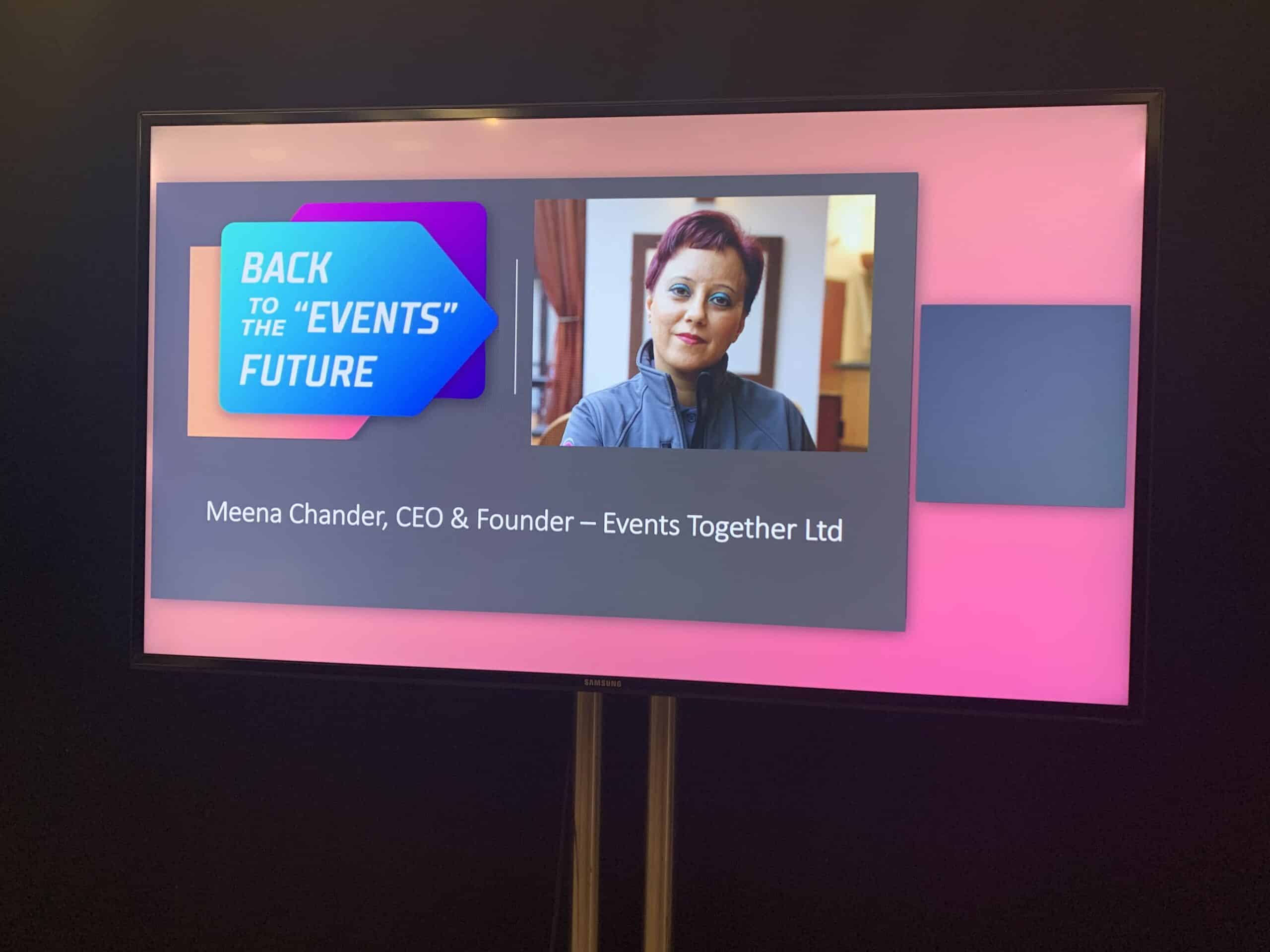
Firstly, it was important that this logo tied in well with all existing Events Together branding, as it is a part of that company. So, we made sure to use their existing colour palette. This way, it is clear that the event belongs to them, but also that it is a separate entity and an event in its own right.
Furthermore, we played Back To The “Events” Future and its name by creating a logo which has futuristic echos. The use of the arrow as an integral part of the branding also reflects its name and gives a sense of moving forward in the events space. This is exactly what the webinar was all about, so it felt very fitting!
Overall, we feel that the logo and other branding ties in very well with the webinar and what it was all about. It helped to elevate Back To The “Events” Future’s presence online and give it it’s own identity, helping it to stand out from a sea of other events.
If you’re in need of branding or creative design help, whether big or small, please get in touch with us today- we’d love to hear from you!


