


In This Article
When it comes to Colour Theory, Delivered Social certainly has an opinion!
Colour is one of the most powerful tools in branding. It shapes perceptions, evokes emotions, and influences purchasing decisions, often subconsciously. Think about some of the world’s most recognisable brands. McDonald’s uses bold red and yellow, Apple has its sleek and minimalist grey, and Facebook is instantly associated with deep blue. These colours aren’t chosen at random. They are carefully selected to align with brand identity and create a lasting impression.
Studies show that up to 90 percent of a consumer’s initial assessment of a product is based on colour alone. The right colour choices can make a brand instantly memorable, establish trust, and even drive conversions.
For businesses, understanding colour theory is essential when creating logos, websites, packaging designs, and social media graphics. The right colour palette can increase brand recognition, boost engagement, and enhance customer loyalty. However, choosing the wrong colours or using them inconsistently can dilute a brand message and turn potential customers away.
This guide explores the fundamentals of our theory, its impact on branding, and how businesses can use it effectively. Whether you’re a social media manager, designer, or content creator, this article will help you create visually appealing, high-impact marketing materials that leave a lasting impression.
Understanding The Basics
To use colour effectively in branding and marketing, you first need to understand the basics of colour theory. At its core, it is a science and art of how colours interact, complement each other, and create visual harmony.
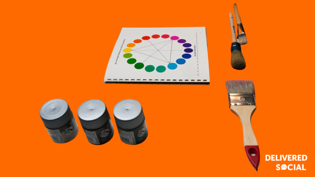
The Colour Wheel
The wheel is a fundamental tool in design and marketing. It consists of:
- Primary: Red, blue, and yellow – these cannot be created by mixing other colours.
- Secondary: Green, orange, and purple – created by mixing two primary colours.
- Tertiary: Formed by mixing a primary colour with a secondary colour, such as red-orange or blue-green.
Understanding these relationships helps brands choose colours that work well together and enhance visual appeal.
Warm, Cool, and Neutral Colours
Colours are typically grouped into three categories based on the emotions they evoke:
- Warm (Red, Orange, Yellow) – Associated with energy, passion, and excitement. Often used in food, retail, and entertainment industries to grab attention.
- Cool (Blue, Green, Purple) – Convey calmness, trust, and professionalism. Frequently used by tech companies, healthcare brands, and financial institutions.
- Neutral (Black, White, Grey, Beige) – Provide balance and sophistication. Often used in luxury branding and minimalist design.
Colour Harmony in Branding
Brands use colour harmony to create a visually pleasing aesthetic. Some common approaches include:
- Complementary (Opposites on the colour wheel) – High contrast, often used for bold and striking visuals (e.g. blue and orange).
- Analogous (Next to each other on the wheel) – Create a harmonious and cohesive look (e.g. blue, teal, and green).
- Monochromatic (Different shades of one colour) – Offer a modern and minimalistic feel (e.g. different shades of purple).
By understanding these basics, businesses can choose the right colour combinations to create strong branding and marketing materials that resonate with their audience.

Colour Combinations & Branding: How to Create a Cohesive Palette
Creating a consistent and recognisable brand identity requires a well-balanced palette. The right colour combinations can enhance brand perception, make marketing materials visually appealing, and increase engagement.
Understanding Colour Schemes
There are three main types of colour schemes used in branding and design:
-
Monochromatic – Uses different shades, tints, and tones of the same colour.
- Creates a clean, elegant, and minimalist look.
- Example: Apple’s branding (shades of grey, silver, and white).
-
Complementary – Uses two opposite colours on the colour wheel.
- Creates a high contrast and eye-catching effect.
- Example: McDonald’s (red & yellow) for excitement and hunger appeal.
-
Analogous – Uses three adjacent colours on the wheel.
- Creates a harmonious, natural feel.
- Example: Instagram’s gradient of purple, pink, and orange.
How to Mix Colours for Branding
To create a cohesive brand palette, consider these steps:
- Choose a Primary Colour – The main colour representing your brand (e.g., Facebook’s blue).
- Add a Secondary – A complementary or analogous colour that balances the primary.
- Select an Accent – Used sparingly to highlight key areas (e.g., CTA buttons).
A strong example is Coca-Cola, which sticks to red and white to evoke energy and excitement while ensuring high visibility across marketing materials.
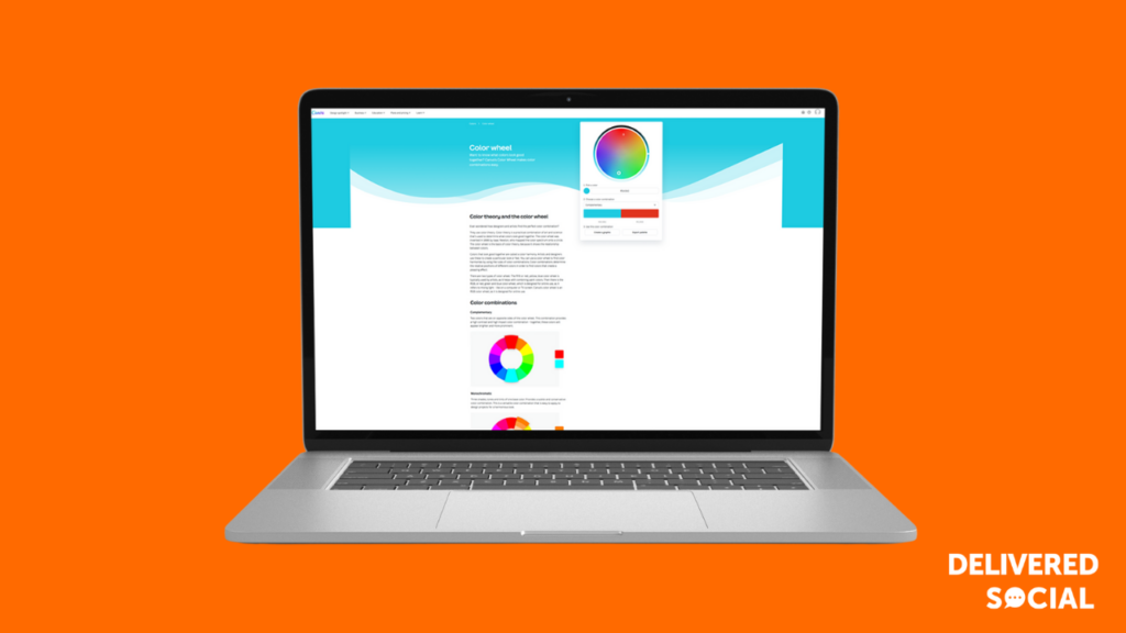
Using Canva’s Colour Wheel & Other Tools
Free tools like Canva’s Colour Wheel, Adobe Color, and Coolors help businesses:
- Generate matching colour palettes based on brand identity.
- Test contrast levels to ensure readability.
- Preview how colours appear on different backgrounds.
Case Studies: Brands That Nailed Their Colour Strategy
Some of the world’s most recognisable brands have built their identities around carefully selected colours that evoke the right emotions and resonate with their audience. Here are some standout examples:
1. McDonald’s – Red & Yellow for Appetite & Energy
McDonald’s uses red and yellow to create a sense of urgency and excitement while stimulating hunger.
Lesson: Bright, high-energy colours work well for fast food and impulse-driven industries.
2. Facebook – Blue for Trust & Security
Facebook’s blue branding was chosen deliberately to evoke trust, professionalism, and calmness. It also appeals to a global audience.
Lesson: Blue is ideal for tech and financial brands looking to build credibility.
3. Starbucks – Green for Calm & Sustainability
Starbucks’ deep green palette promotes relaxation and aligns with its eco-conscious values.
Lesson: If sustainability is a core part of your brand, earthy tones like green and brown can reinforce this message.
4. Tiffany & Co. – The Power of Signature
Tiffany’s iconic turquoise blue is instantly associated with luxury, exclusivity, and elegance.
Lesson: A unique, recognisable colour can become a brand asset that differentiates you from competitors.

FAQs: Colour Theory & Branding
1. What is the best colour for branding?
There isn’t one “best” colour for branding – the right one depends on your brand personality and the emotions you want to evoke. Blue conveys trust and professionalism, making it ideal for financial institutions or tech companies. Red stimulates excitement and urgency, great for the food industry. Understand your audience’s perception and cultural context before making a choice.
2. How do colours affect customer trust and engagement?
Colours play a significant role in shaping brand perception and trust. For example, blue is commonly used by brands to evoke a sense of security and credibility, while green is often associated with sustainability and calm. When you select colours that align with your brand’s core values, it fosters trust and increases engagement with your audience.
3. What are the biggest mistakes businesses make when choosing brand colours?
The most common mistakes include overcomplicating colour choices, using too many colours, or not considering cultural differences. Businesses also fail when they don’t test their colour choices with their target audience. It’s important to remember that your choices should be simple, meaningful, and consistent across all platforms.
4. How often should you update your brand colour scheme?
You don’t need to change your brand’s colour scheme frequently. However, if your business evolves or targets a new audience, it might be time to refresh your colours to ensure they still resonate with your audience. Major rebrands usually occur every 5-10 years.
5. Can colours affect conversions and sales?
Yes, they certainly can impact conversion rates and sales. Bright, contrasting colours can encourage action, like purchasing or signing up, while subtle colours can create a sense of trust. A/B testing different colours on your website or ads can help determine which ones drive the most conversions.


