


In This Article
Every product designer knows the “icon problem.”
You start a project with a clean, open-source pack like Feather or Heroicons. It looks fantastic until the client requests a specific icon that isn’t in the set-perhaps a “drone delivery” or a “smart fridge.”
Suddenly, you are stuck.
You have three bad options: draw it yourself (time-consuming), hire an illustrator (expensive), or grab a similar-looking icon from a different set (inconsistent).
Icons8 attempts to solve this specific friction point. Instead of operating as a marketplace of random assets, it functions as a centrally managed system. While the library holds over 1.4 million icons, volume matters less here than strict adherence to style guidelines.
The central question is simple: How can a team maintain a consistent visual language across products without building and maintaining every icon set in-house?
The Architecture of Consistency
Most icon sites aggregate uploads from thousands of different designers. This leads to varying stroke widths, corner radii, and perspective rules. Icons8 takes a different approach: they produce the vast majority of their assets internally.
Select the Material Outlined style, and you gain access to 5,573 icons that strictly follow Google’s Material Design guidelines. Switch to iOS 17, and you get 30,000+ icons matching Apple’s specific weight and curve standards.
The library covers a wide spectrum of fidelity:
- Platform Standards: iOS (Glyph, Outlined, Filled), Android (Material), and Windows 11.
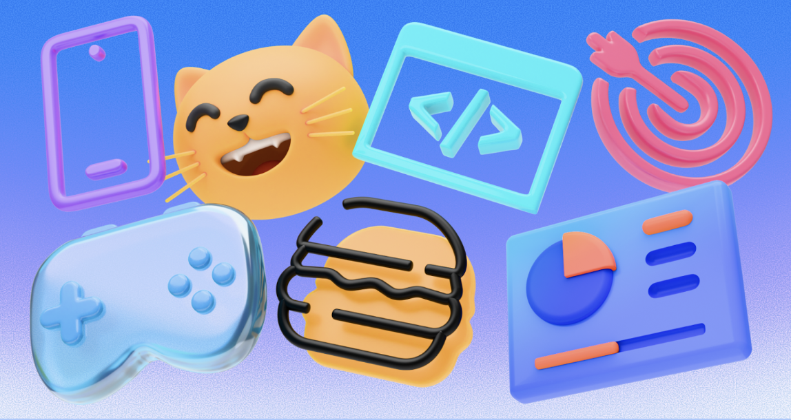
- Aesthetics: 3D Fluency, Liquid Glass, and Hand Drawn.
- Formats: Static (PNG, SVG, PDF) and Animated (Lottie JSON, GIF, After Effects).
Scenario: Building a Cross-Platform Fintech App
To see how this works in production, look at a UI designer tasked with creating a banking app. It needs to feel native on both iOS and Android.
The designer defines the navigation menu: Home, Transfer, Cards, and Settings. Finding these basic icons is easy. But the app also needs specific assets for “Crypto Trading,” “Recurring Bill,” and “Chat Support.”
The iOS Workflow
The designer selects the iOS 17 Outlined category. Searching for “Bitcoin” reveals a match that shares the exact 1.5px stroke weight as the standard “Home” icon. They download the SVG (a paid feature) to ensure it scales losslessly on Retina displays.
The Android Adaptation
Instead of hunting for a new set for the Android version, the designer simply switches the library filter to Material Outlined. The search results update instantly. The concepts-“Crypto” and “Bill Pay”-remain, but they are redrawn to match Material Design specs with squarer geometry and different fill rules.
Customization
The bank’s primary brand color is a specific shade of teal. Before downloading, the designer uses the in-browser editor. They paste the brand’s HEX code into the color picker, and the entire set is recolored instantly. Finally, they download the assets as Lottie JSON files for the onboarding screens, adding smooth, resolution-independent animations without bloating the app size.
Scenario: The Non-Designer Marketing Sprint
Product managers and marketers often need professional assets but lack vector editing skills. Icons8 fits this use case well.
Imagine a marketing manager creating a pitch deck. They need to visualize a “Growth Strategy.” Searching for “Rocket” on a standard stock site yields results ranging from cartoons to photorealistic 3D renders.
In Icons8, the manager selects 3D Fluency to give the presentation a modern, high-end look. They find a rocket icon, but it blends into their dark slide background.
Using the In-Browser Editor
They click the icon to open the editor overlay.
- Background: They add a square background behind the 3D icon.
- Styling: They adjust the background color to a soft white and increase the corner radius to make it a “squircle.”
- Padding: They increase the padding so the rocket has room to breathe.
- Export: Since this is for a slide deck, vector data isn’t necessary. They download a 1600px PNG (available on the paid plan) to ensure it looks crisp on a 4K projector.
This process happens entirely in the browser. No Photoshop required.
A Typical Workflow: Tuesday Morning with Pichon
Browser workflows can feel slow for power users. That’s where Pichon, the desktop app, fits into the daily routine.
At 9:00 AM, a developer opens Pichon on their Mac. It floats over their code editor. They are building a settings page and need a “Logout” icon. They drag the icon directly from Pichon into their IDE. Because they set their preferences earlier, the app automatically drops the asset as an SVG code snippet rather than an image file.
By 11:00 AM, they are updating the footer. They need social media links. They search for a netflix logo to link to a documentary the company produced. They find it in the Logos category, recolor it to monochrome gray to match the footer aesthetic, and drag it in.
Later that afternoon, they realize they are missing a very specific icon: “Server Maintenance.” They check the library. It exists, but not in the specific Windows 11 style they are using. They use the Icon Request feature. After submitting the request, if it garners enough community votes (usually around 8 likes), the Icons8 team queues it for production.
Comparing the Alternatives
When evaluating Icons8, you are likely looking at three main alternatives:
Open Source Packs (Feather, Heroicons)
- Pros: Free, lightweight, perfect for code.
- Cons: Extremely limited vocabulary. These are great for standard UI elements (arrows, user, home). But if you need “sushi roll” or “electric scooter,” you will hit a wall immediately.
Flaticon
- Pros: Massive variety.
- Cons: Inconsistency. Flaticon aggregates content from thousands of authors. You might find a great “User” icon by Author A and a “Settings” icon by Author B, but they will have different line weights and styles. Icons8 prioritizes single-author consistency across the pack.
Noun Project
- Pros: Artistic diversity and conceptual depth.
- Cons: Similar to Flaticon, consistency is the enemy here. Noun Project is excellent for finding a unique visual metaphor, but difficult for building a cohesive UI system.
Limitations and When to Look Elsewhere
Despite the extensive library, potential users should understand the friction points.
The SVG Paywall
The most significant limitation for free users is format restriction. Free accounts can only download PNGs up to 100px. If you need vector formats (SVG/PDF) for responsive web design or print, you must upgrade to a paid plan. The only exceptions are the Popular, Logos, and Characters categories, which offer more flexibility.
Simplified SVGs
By default, Icons8 downloads SVGs in a “simplified” format. This merges paths to reduce file size. If you plan to animate individual parts of an icon-like making the hands of a clock spin-or edit anchor points in Illustrator, remember to uncheck the “Simplified” box in the settings before downloading.
Attribution
The free tier requires a link back to Icons8. For internal decks, this is fine. For a client website or a commercial app, the attribution requirement can look unprofessional, effectively making the paid plan mandatory for commercial work.
Practical Tips for Power Users
If you integrate Icons8 into your workflow, these practices will save time:
- Use Collections for Bulk Actions: Don’t download icons one by one. Drag everything you need for a project into a “Collection.” You can then recolor the entire collection in one click and download a ZIP file containing all assets.
- Get the Plugins: If you work in Figma, Photoshop, or Illustrator, install the plugin. It saves the step of downloading and importing. There is also a Google Docs add-on for documentation writers.
- Check the “Designers” Filter: In the search bar, filter by “In-house” vs. “Independent authors.” Sticking to In-house usually guarantees better consistency across different icons.
- Edit Before Download: If you are using PNGs, use the “Padding” slider in the editor. Aligning icons in a grid is much easier if they all have built-in square padding rather than trying to center irregular shapes via CSS.
Summary
Icons8 acts less like a creative marketplace and more like a utility for visual consistency. It excels when you need a large volume of assets that look like they were drawn by the same hand. While the cost of entry for vector access is a consideration, for teams that cannot afford a dedicated iconographer, it bridges the gap between generic open-source sets and custom illustration.


