




Keep reading
Rather we just did it for you?
Let's get your business seen.
Social media, websites, SEO and ads from a team you can actually meet.
You have taken lovely photos of your work, your team and your products, and now they are sitting in a folder doing nothing. That is a shame, because for a lot of small businesses the pictures are the pitch. A well-built photo gallery on your website can do more selling than three paragraphs of copy, whether you run a wedding-cake business, a building firm or a cosy little cafe. We say this to clients all the time: people buy what they can picture themselves enjoying, so give them something to look at.
The good news is that showing photos on the web has never been easier or cheaper. You do not need a developer or a big budget, just a bit of thought about layout, loading speed and the story you want the images to tell. Let us walk through what a gallery is, why it matters, and exactly how to add one that looks the part.
What a photo gallery on your website actually is
At its simplest, a gallery is a tidy, organised way of displaying a group of images on a single page, rather than dumping them one after another down the screen. Think of the grid of thumbnails you click to open a larger version, or a neat slideshow that cycles through your best shots. The point is presentation: a gallery gives your pictures structure, so visitors can scan them quickly and dive into the ones that catch their eye.
Galleries come in a few flavours. A grid lays everything out in even rows and columns; a masonry layout fits images of different shapes together like a Pinterest board; a carousel or slider shows one image at a time with arrows to move along. They all do the same core job, which is showing photos in a way that feels deliberate rather than accidental.
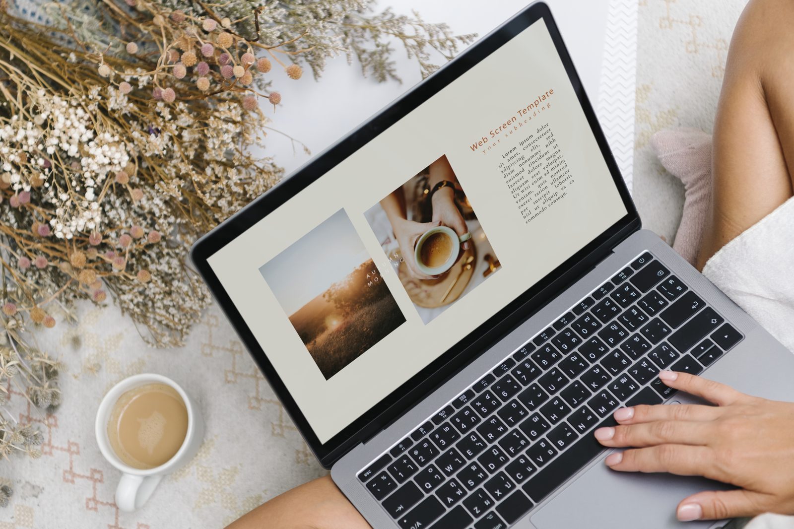
Why showing photos well matters for a small business
Strong images build trust before a single word is read. A gallery of real, recent work tells a prospective customer that you are established, that you take pride in what you do, and that you have nothing to hide. That reassurance is worth a great deal when someone is deciding whether to fill in your contact form or click away.
There is a practical selling angle too. Photos answer questions that copy struggles with: what will the finished kitchen look like, how big are the portions, does the venue suit my style. Showing photos up front removes doubt and shortens the path to an enquiry. Galleries also keep people on the page longer, and a visitor who lingers is far more likely to get in touch than one who bounces after three seconds. Related reading: How to Add a Stunning Image Gallery to Your Website.
How to add a photo gallery on your website step by step
The exact buttons vary between platforms, but the process is broadly the same whether you use WordPress, Wix, Squarespace or Shopify. Here is the approach we recommend.
Choose and cull your best images
Start by being ruthless. Ten brilliant photos beat forty average ones, because a gallery is only as strong as its weakest picture. Pick images that are sharp, well-lit and genuinely representative of your work, and leave out anything blurry, dated or off-brand.
Resize and compress before you upload
Huge image files are the number-one cause of slow galleries. Resize photos to a sensible width (around 1600 pixels is plenty for most sites) and compress them so each file sits comfortably under a few hundred kilobytes. Your pages will load faster and your visitors, and Google, will thank you.
Pick a layout and add the gallery block
Most website builders have a built-in gallery block or widget: you drop it onto the page, select your images, and choose a grid, masonry or slider style. Keep the layout consistent with the rest of your site, and set the columns so the thumbnails are big enough to appreciate on both desktop and mobile.
Add captions, alt text and links
Give each image descriptive alt text so it is accessible and search-friendly, and add short captions where they add context, such as the location of a project or the name of a dish. If a photo relates to a service, link it through to the relevant page so a curious visitor can act on the interest you have just sparked.
Test on mobile and publish
More than half your visitors will be on a phone, so check the gallery there before you go live. Make sure images are not cut off, that tapping opens the larger view smoothly, and that nothing pushes your load time through the roof. When it looks right on a small screen, publish with confidence.
Gallery styles compared: which layout suits you
Choosing the right style makes a real difference to how your photos land. Here is how the main options stack up:
- Grid gallery: clean, predictable and easy to scan, which makes it ideal for products or a portfolio where consistency matters most.
- Masonry layout: great when your images are lots of different shapes, because it fits them together neatly without awkward cropping, though it can feel busier.
- Carousel or slider: perfect for a homepage hero or a small set of hero shots, but risky for large collections since people rarely click past the first few slides.
- Lightbox pop-up: not a layout on its own but a lovely add-on, letting visitors open a full-size image over a dimmed background without leaving the page.
- Before and after slider: a brilliant choice for trades and transformations, where dragging a handle to reveal the change is far more persuasive than two photos side by side.
There is no single right answer; the best layout is the one that flatters your particular photos and matches how your customers like to browse.
Best practices for showing photos online
A few habits separate a gallery that sells from one that just sits there. Keep your images consistent in style and editing, so the collection feels like one considered set rather than a random scrapbook. Update it regularly, because a portfolio full of work from five years ago quietly signals that business has been quiet. And always, always optimise for speed; a beautiful gallery that takes eight seconds to appear has already lost most of its audience.
It also pays to guide the eye. Lead with your single strongest image, group related photos together, and give the whole thing room to breathe with a bit of white space around the edges.
Common mistakes that make galleries look amateur
We see the same slip-ups again and again. The biggest is uploading enormous, uncompressed files that grind the page to a halt. Close behind is quantity over quality: cramming in every photo you own dilutes the good ones and bores the visitor. Inconsistent editing, where one shot is warm and moody and the next is cold and flat, makes even good work look scrappy.
Other traps include forgetting mobile users entirely, skipping alt text so the gallery is invisible to search engines and screen readers, and burying your photos three clicks deep where nobody finds them. A gallery only works if it is fast, curated and easy to reach.
Where web galleries are heading next
Galleries are getting smarter and more immersive. We are seeing more sites lean on lazy loading, where images only download as you scroll to them, which keeps pages snappy even with dozens of photos. Interactive touches such as three-hundred-and-sixty-degree views, short looping video clips mixed in with stills, and shoppable images that link straight to a product are all becoming easier to add.
Artificial intelligence is creeping in too, tagging and sorting images automatically and even suggesting which of your photos perform best. The underlying lesson will not change, though: a fast, well-curated set of genuine images will always beat a gimmick.
What is the best way to display photos on a small business website?
For most small businesses, a clean grid gallery of ten to twenty of your very best images, compressed for speed and opening into a lightbox, hits the sweet spot. It is simple to build, looks professional, and works beautifully on mobile. Add captions and alt text, keep it current, and you have a gallery that quietly earns enquiries.
How many photos should a website gallery have?
Fewer than you think. Somewhere between ten and twenty carefully chosen images is usually ideal, because it gives visitors a real sense of your work without overwhelming them or slowing the page. If you have a large body of work, split it into themed galleries rather than one enormous wall of pictures.
Will a photo gallery slow down my website?
Only if you let it. Galleries slow down when the images are too large or too numerous, so the fix is to resize and compress every photo before uploading and to use lazy loading where your platform supports it. Done properly, a gallery adds very little to your load time while adding a great deal to your appeal.
Do I need special software to show photos on my site?
In almost all cases, no. WordPress, Wix, Squarespace and Shopify all include gallery tools out of the box, and there are free plugins if you want fancier layouts or lightbox effects. You only need to reach for specialist software if you have very particular requirements, and even then it is worth asking whether the built-in options will do.
Your quick photo gallery checklist
Before you hit publish, run through this list:
- Curated: have you kept only your genuinely strong images?
- Compressed: is every file resized and under a few hundred kilobytes?
- Consistent: do the photos share a similar style and edit?
- Accessible: does each image have descriptive alt text?
- Mobile-friendly: does it look and load well on a phone?
- Current: is your most recent and best work front and centre?
Let us help your photos do the selling
A great photo gallery on your website is one of the simplest, highest-impact upgrades a small business can make; it turns pictures you already own into a quiet, round-the-clock salesperson. If you would like a hand choosing images, building the gallery or speeding up a site that has grown sluggish, that is exactly the sort of thing we love doing. Get in touch with the Delivered Social team for a friendly, no-pressure chat, and let us help your photos work as hard as you do.
































