


In This Article
The user interface (UI) is the backbone of a software product. When done right, users don’t even notice them, but these users can create a stir when it’s missing.
In a quest of making the software product visually appealing, companies spend most of their budget on design trends and fashion while overlooking the user interface design principles.
The UI supports user experience (UX) and lends a helping hand in bringing concepts from visual design, interaction design, and information architecture.
What’s the hustle and bustle surrounding UI?
UI is a feature of a software product that helps a user interact with it. It’s an essential component of design because an excellent UI design focuses on various aspects such as responsiveness, efficiency, aesthetics, and accessibility. Other features of UI are ease of use, consistent layout, and high-quality graphics.
Like Rome, you cannot improve the UI in a day because it requires meticulous planning and hard work.
In this article, we discuss some ways to improve user interface design and maximise conversions and sales.
8 Ways to Improve User Interface and Maximise Conversion and Sales in 2022
Here are some tips for improving the UI of your product:
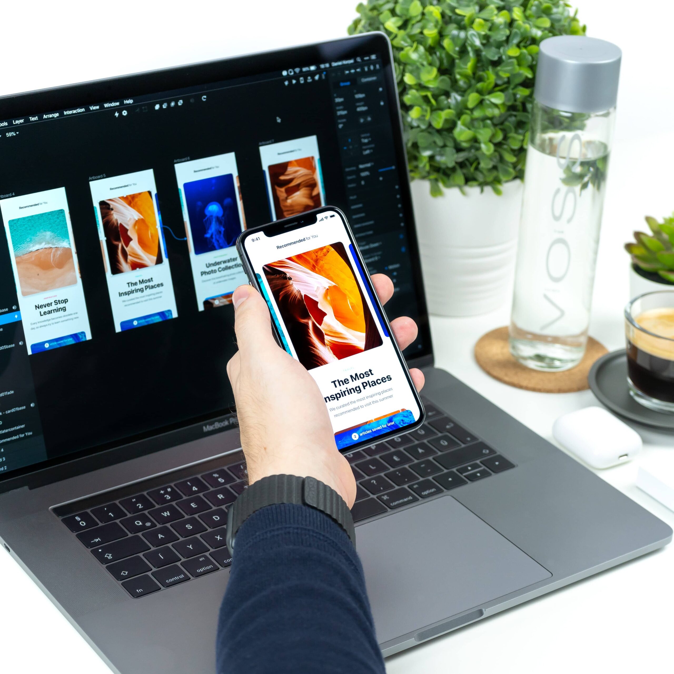
1. Use UI design tools
As you know that UI is a critical component of a digital product, it’s challenging to create accurate mock-ups, wireframes, and prototypes. These are essential features for a great UI design because they represent a design’s nuts and bolts and communicate its functionality.
That’s where developers and designers focus on using UI design tools. Tools like VistaCreate can also help teams quickly design visual elements, prototypes, and marketing assets that align with the overall interface and branding. These tools help in structuring the information architecture of a product. They help developers create visually appealing software, and all elements work together to create a product that resonates with your audience.
A bad visual design sends your visitor away screaming. Interestingly, a well-designed UI increases the website conversion rate by 200%, according to research.
So, you need to use design tools that let you remotely test prototypes, software elements, and wireframes. The tool helps in providing a browser-based experience that seamlessly tests out various designs and functionality of your product.
2. Focus on typography
It might be right to say that you should never use more than two fonts and over one style in a product. While this might seem a naïve suggestion, typography plays an essential role in improving the UI of your product. Though many designers might be adhering to the typography rules, some intricacies require attention.
- Uppercase tracking: When using all capital letters in your text, focus on setting up the letter spacing. This prevents characters from sticking with each other and makes your content more readable.
- Light, thin, and hair font style: When designing a product that users are likely to see on a screen, never use Thin and Hair font styles. These fonts are difficult to read on a screen and create an effect of broken pixels on specific screens.
- Line height: To improve readability, use a larger line-height for large text blocks. Ensure to use the same approach for headings to ensure that the letter’s tail does not touch each other.
- Text and heading hierarchy: Every time you have to highlight an essential aspect of a text, bold it. If you use the bold style throughout your text, it becomes unclear why you want to emphasize a particular aspect.
- Text contrast: Another critical UI feature to consider is paying special attention to the color of your text in your design. There should be sufficient contrast so that your text is readable on every type of screen.
3. Reduce visual clutter and maintain consistency
Overwhelming users with too much visual information can reduce the usability of your application or website.
The primary purpose of removing clutter is to reduce the noise on your page so that users can access relevant pieces of information. When you remove visual clutter from your product, it allows users to complete their journey through the interface efficiently.
Also, when creating an application or software product, maintaining consistency is impossible.
However, consistency is the key to UI/UX design as it improves your product’s learnability.
Usually, a UI designer achieves consistency by using repetition of component usage like information architecture. Maintaining consistency helps streamline the look and feel of your product’s branding throughout the user’s journey.
Using multiple colours, buttons, and links can distract the users, and they cannot recollect anything about your brand.
4. Create an easy-to-navigate interface
For improving your UI and maximizing conversions, ensure that your website or product navigation is self-evident. Even a B2B software product should not intimidate users, so they’re afraid of pressing a button.
94% of users expect that a website must be easy to navigate. A good UI interface puts users in their comfort zone by providing the context of how to navigate and use a particular feature of your website or product.
- Create visual cues: Visual cues serve as a reminder for users as it helps them navigate through the interface. It provides points of reference as they move through a product interface. When users start wondering where they are and how they should reach a particular destination, it reduces their experience because the UI designs fail to serve their purpose.
- Focus on predictability: When designing a product, you need to provide visual cues that help users predict the result of an action. A user should not be wondering what a particular button is for or which button they should press to complete their task. Such things reduce user experience, and they might switch to other products.
5. Apply the principle of less being the new ‘more’
Usually, there is a manager in every design team who constantly pushes on having every possible information in a single block. Without wasting an inch of space, they prefer filling it with text that they deem helpful for the users.
So, instead of having the logo, phone number, address, and offers in a single block, focus on sharing less information. The less information a user receives, the easier it becomes to take the desired step.
Users and customers are adept at gradual information intake because it helps them process information and ensure a pleasant experience.
When it’s challenging for a user to decipher your interface layout, they’re probably never going to come back to that brand.
Also, tightly grouping so many elements is ugly, unprofessional, and unaesthetic.
6. Give importance to the shadow, icons, and images.
Ensure that the shadow under an object or element is never black. The shadow should always be a darker shade than the surface on which it is cast. Interestingly, an object can cast two shadows: small and bright, while the other is blurry and transparent.
So, to enhance UI and maximise conversions, avoid using unnatural shadows.
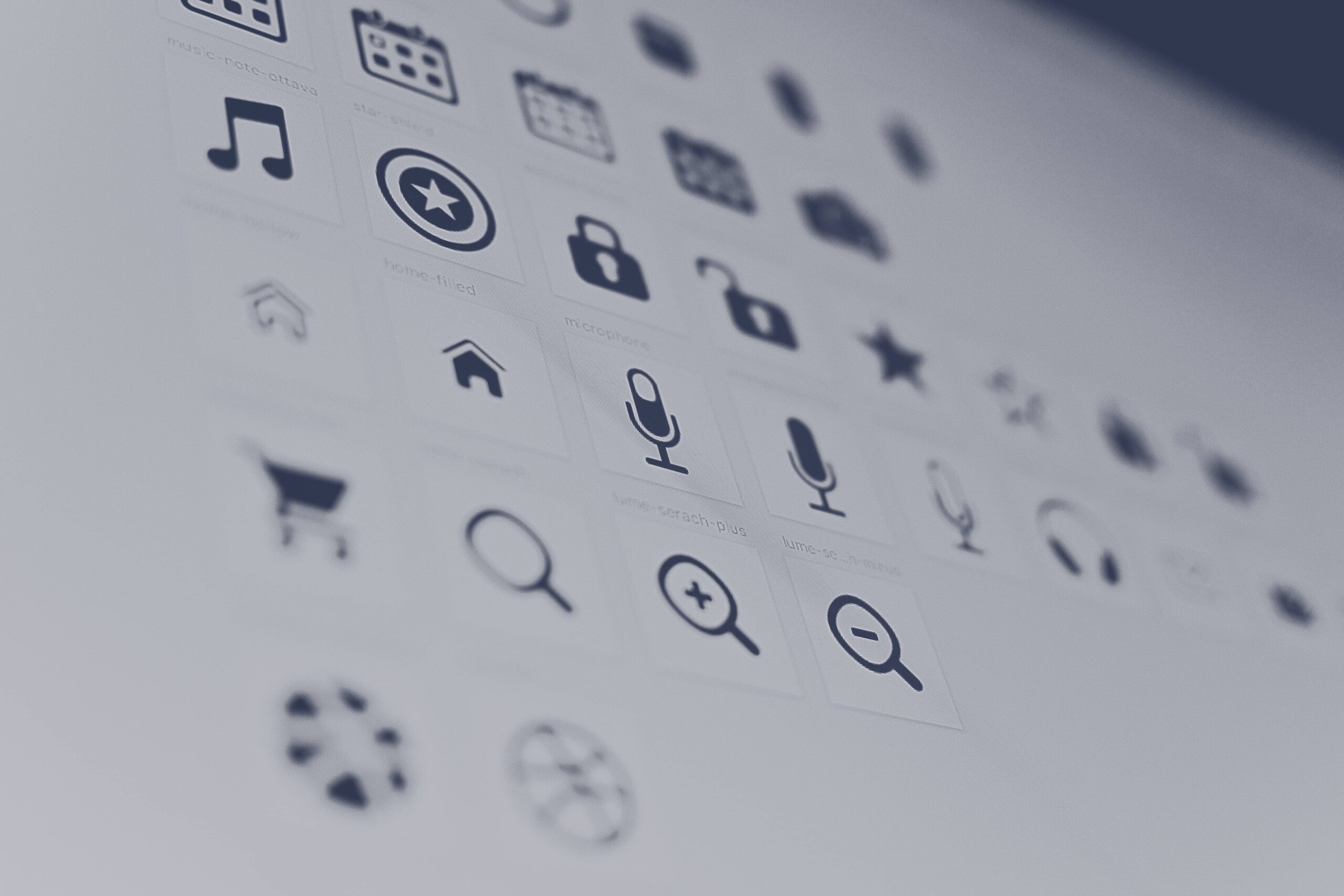
When adding images, always provide only the SVG or vector format. This is because the PNG format has blurry edges that might look unprofessional. Besides, the vector format occupies less memory. Also, when using icons in your app, website, or product, ensure to use icons from a single family.
Single-family icons have equal border-radius and stroke width. So, it ensures that every icon enjoys an equal mass and each icon fits in the same size square.
7. Provide feedback
The last thing your users want is to not be able to understand what’s going on. Though you can achieve it in several ways, ensure it appears on the page. If your user presses a button, focus on indicating that the button was pressed.
For instance, when uploading files to a document manager application, indicate the time required or remaining to upload the document.
So, whenever a user takes action on your interface, providing feedback could be the difference between a lacklustre and good experience.
8. Focus on using design principles
The adage “If it ain’t broke, don’t fix it” rings true because there is no need to revamp or revitalize a feature when standard features are performing above expectations.
For instance, the global search bar of any app is a magnifying glass, and asking users what search symbol would resonate with them is a waste of time.
Also, you’re likely to find the search bar in the top right-hand corner or the center of the top section. So, it doesn’t make sense to place your search bar in the footer or bottom left corner because users don’t know where to look.
People know that everyone uses a ‘?’ symbol when asking questions. So, never use an exclamation mark for that purpose.
[code_snippet id=6]Key takeaway
The primary goal of every UI designer is to provide interfaces that encourage exploration without being fearful of the negative aspects.
With these UI designs tips, companies can maximise conversion and sales. They become ready to knock your next design project straight out of the park.
So, focus on applying some or all of these tips to improve your UI because that eventually results in a good UX.
Author’s bio
Priya Jain has been copywriting professionally for over 8 years. She teaches math, spends her time running behind her toddler and tries new recipes whilst she isn’t writing. She has attained an engineering degree, and an MBA. You can find her on LinkedIn.
Want to improve your website? Check out these 12 telltale signs that you might need to spend a little cash on.


