


In This Article
Mobile friendly web design means building your website so it works beautifully on smartphones and tablets, not just desktop computers. For your UK business in 2026, it is a fundamental requirement rather than an optional extra. With the majority of web traffic now coming from mobile devices and Google prioritising mobile-friendly sites in its rankings, a seamless mobile experience determines whether customers find you, trust you, and choose you over competitors.
Table of Contents
- Why does your business need a mobile friendly website?
- What is the difference between responsive and mobile-first design?
- What are the key features of a mobile friendly website?
- How does mobile friendly web design impact your search rankings?
- How can Delivered Social help you build a mobile friendly website?
- What common mobile website mistakes should you avoid?
- How do you test if your website is mobile friendly?
- Key Takeaways
- References
Why does your business need a mobile friendly website?
Your business needs a mobile friendly website because most of your potential customers are already searching for you on their phones. According to Mailchimp, mobile devices generated over 54% of global website traffic in 2021, and that figure has only grown since. If your site is not optimised for mobile, you are likely losing potential customers every single day.
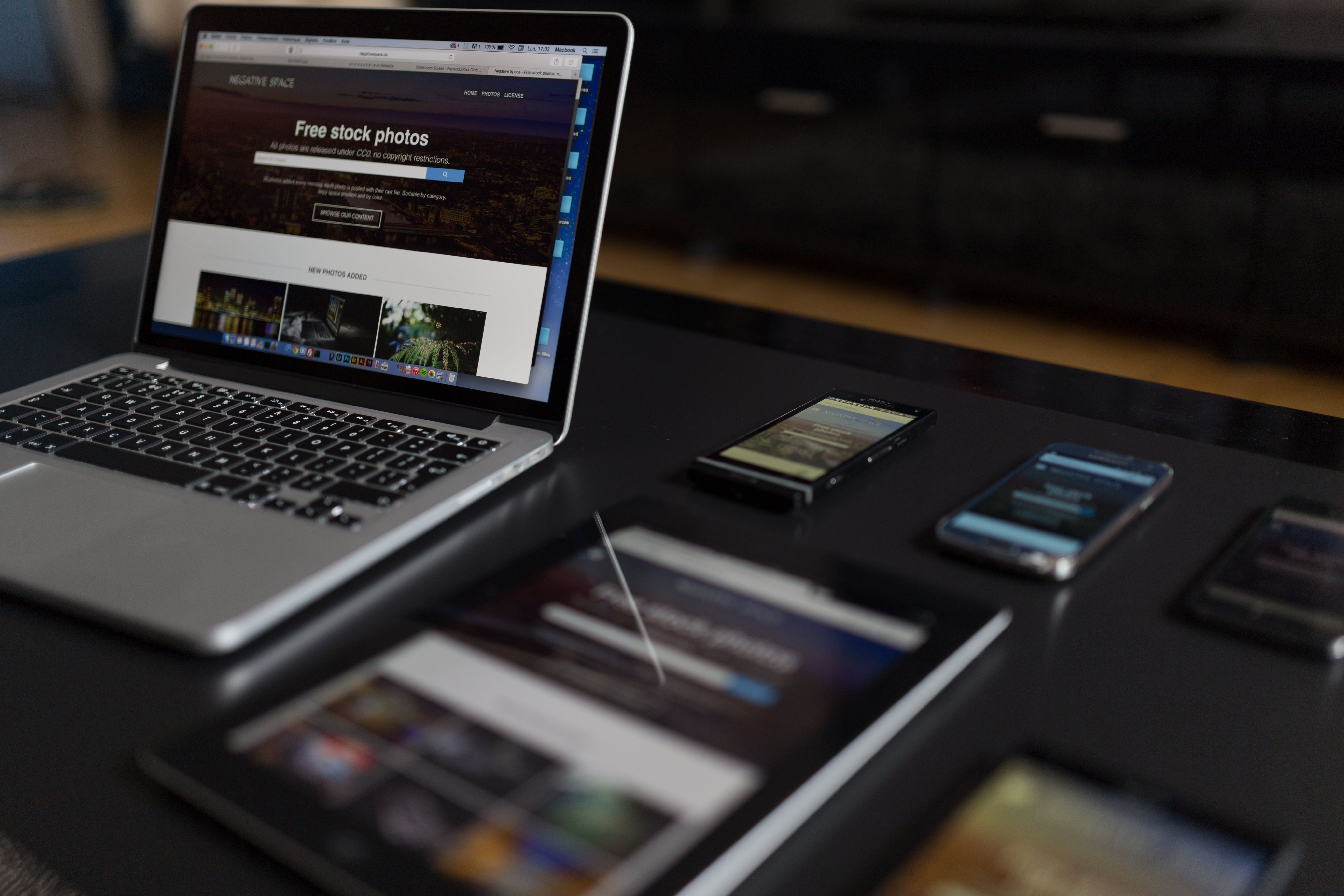
Google has prioritised mobile-friendly websites in search rankings since 2015 and now uses mobile-first indexing. This means Google looks at your mobile site first when deciding where to rank you in search results, according to Figma. A desktop-only experience will not save you from a poor mobile ranking.
A mobile friendly website is also critical for capturing leads and conversions. Features like click-to-call buttons and easy navigation turn casual browsers into paying customers, as noted by Mailchimp. More than half of all Google searches happen on mobile devices, according to MBB Agency, so a difficult mobile experience makes you effectively invisible to a huge pool of potential clients.
What is the difference between responsive and mobile-first design?
Responsive design is a technical method where code automatically adapts your site to the screen size it is being viewed on. According to Mailchimp, responsive design typically begins at maximum desktop resolution with elements scaling down for smaller devices. This approach ensures your website remains usable across all screen sizes without building separate versions.

Mobile-first design is a strategy where you design for the smallest screen first and then enhance the layout for larger devices. MBB Agency explains that mobile-first thinking prioritises the mobile user experience from the very start of the design process. This often leads to a more streamlined and focused user experience because every element must justify its place on a small screen.
Both approaches aim to create a mobile friendly website, but understanding the distinction helps you ask the right questions when briefing a web design partner about your project goals. Knowing whether a team builds responsive sites or adopts mobile-first thinking gives you insight into how they approach the mobile experience.
What are the key features of a mobile friendly website?
A successful mobile site uses a single-column, vertical layout so users can scroll naturally without pinching or zooming. Figma notes that mobile-friendly websites consistently display content in a single column, which keeps the experience simple and focused. This layout respects how people naturally hold and use their phones.
Touch targets should be at least 44×44 pixels with adequate spacing to prevent accidental taps, according to Figma. Fonts should also be easy to read on smaller screens, with recommended mobile-friendly options including Roboto, Inter, and Montserrat. Large buttons are essential because small or tightly packed links frustrate users and drive them away.
Best practice includes avoiding pop-ups that are difficult to close on mobile devices, as highlighted by Mailchimp. The logo should always link back to the homepage, especially when the navigation menu is tucked away, according to Figma. Features like smaller optimised images, auto-fill form fields, and faster page loading are also essential for keeping mobile users engaged, as noted by MBB Agency.
How does mobile friendly web design impact your search rankings?
Mobile friendly web design impacts your search rankings directly because Google uses mobile-first indexing. According to Figma, Google looks at the mobile site first when ranking in search results, meaning the mobile version of your website is the primary version used for ranking and indexing.
Since 2015, Google has given priority to mobile-friendly websites, making it a direct ranking factor that you cannot afford to ignore. Mailchimp confirms that this prioritisation has been in place for years and continues to shape how websites are evaluated. A mobile friendly website also contributes to better Core Web Vitals, which are signals Google uses to measure user experience and determine rankings, according to MBB Agency.
If your site is not optimised for mobile, you are likely to be outranked by competitors who offer a smoother experience to smartphone users. The ranking impact is not theoretical; it is a measurable consequence of how Google evaluates websites today.
How can Delivered Social help you build a mobile friendly website?
Delivered Social offers professional website design and development services that prioritise mobile friendly web design as standard. Our team builds websites that perform beautifully on every device, ensuring your business looks professional whether customers find you on a phone, tablet, or desktop computer.
Our team builds responsive websites that adapt seamlessly to smartphones and tablets, incorporating the best practices your customers expect. Clear calls to action, fast loading times, and intuitive navigation are built into every project from the start. We pair your website with reliable hosting to keep your site fast and secure, and we can support your growth with SEO and PPC strategies to drive traffic to your new mobile friendly site.
As an award-winning team with 5-star reviews, we take a partnership approach, explaining everything in plain English so you feel confident about your digital presence. We understand that UK business owners want measurable results without technical jargon, and we deliver exactly that.
What common mobile website mistakes should you avoid?
Pop-ups are a major problem on mobile devices because they are difficult to close and frustrate users. Mailchimp recommends avoiding pop-ups altogether on mobile sites. A user who cannot close a pop-up will simply leave your site and find a competitor.
Failing to streamline content is another common error. MBB Agency notes that mobile sites should have fewer functions and limited text compared to desktop versions to keep the experience focused. Cramming desktop-level content onto a small screen overwhelms users and slows down the page.
Ignoring touch target sizes leads to accidental taps and a poor user experience. Figma advises that buttons and links need adequate spacing, with touch targets of at least 44×44 pixels. Not including a back to top button on long pages makes navigation tedious, and hiding the link to the homepage from the logo confuses users, according to Figma.
How do you test if your website is mobile friendly?
You can test if your website is mobile friendly using Google’s free mobile-friendly test tool. MBB Agency points to this tool at search.google.com/test/mobile-friendly, which lets you check if your website meets Google’s criteria for mobile usability.
You should also test your site regularly on actual mobile devices to experience what your customers see and identify any friction points. Checking your site’s performance in Google Search Console can reveal mobile usability issues that Google has detected. Regular testing and updates are essential because mobile technology and user expectations continue to evolve throughout 2026.
Key Takeaways
- Mobile devices generate over 54% of global website traffic, making mobile optimisation essential for reaching your audience.
- Google has used mobile-first indexing since 2015, meaning your mobile site directly influences your search rankings.
- Responsive design is a technical method, while mobile-first design is a strategic approach to building for smaller screens.
- Touch targets on mobile websites should be at least 44×44 pixels to prevent accidental taps.
- Pop-ups are particularly problematic on mobile devices and should be avoided to improve user experience.
- Google provides a free mobile-friendly test tool to help you evaluate your website’s mobile performance.
- Delivered Social offers website design and development services that build mobile friendly websites for UK businesses.
References
- Mobile Website Design: How to Build a Mobile-Friendly Site — Mailchimp, date unknown
- Mobile website design: 15 best examples — Wix, published March 22 2025
- Mobile website design: 10 inspiring examples + best practices — Figma, date unknown
- Mobile-friendly Website Design and Why It Matters — MBB Agency, date unknown
Share This Article
About the Author: Jonathan Bird