



Keep reading
Rather we just did it for you?
Let's get your business seen.
Social media, websites, SEO and ads from a team you can actually meet.
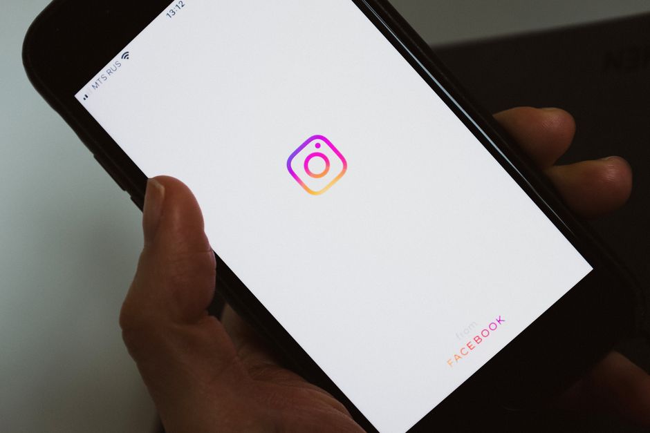
Instagram’s 2026 brand refresh is the platform’s first wordmark change since 2016, and it signals a clear move toward bolder, simpler, and more expressive visual branding. The update celebrates user creativity while keeping the platform’s core identity intact. For UK business owners, this is a timely prompt to audit your own Instagram presence and consider whether your branding still feels current, consistent, and aligned with where the platform is heading.
Table of Contents
- Why has Instagram changed its brand identity in 2026?
- How does Instagram’s new brand system affect the way you should present your business?
- What are the key elements of a strong Instagram branding system for a small business?
- How can you create brand consistency across your Instagram content and profile?
- What does Instagram’s branded content policy mean for businesses working with creators?
- How should you adapt your brand assets to fit Instagram’s updated design guidelines?
- Is now the right time to invest in a professional rebrand for your own business?
- Key Takeaways
- References
Why has Instagram changed its brand identity in 2026?
Instagram changed its brand identity in 2026 because the platform felt it was time for a refresh after a decade with the same wordmark. The previous wordmark had remained unchanged since 2016, making this update a notable visual shift for one of the world’s most recognisable apps. According to Dezeen, the redesign was led in-house by Meta, with director of product design Jasmine Probst and director of brand design May Hartono at the helm.

The new wordmark keeps its cursive style but introduces flattened serifs that are detached from neighbouring letters. Jasmine Probst described the result as “bolder and simpler, with touches of unexpectedness,” according to Dezeen. The design pays homage to crafted script, reflecting the creativity that Instagram has always championed.
Instagram head Adam Mosseri said it was “time for a refresh” in a post on the platform. The update is rolling out globally through 2026 and beyond, signalling a long-term commitment to the new look. According to It’s Nice That, the project was described as “a decade-defining rebrand” built to last a decade and evolve beyond it.
How does Instagram’s new brand system affect the way you should present your business?
Instagram’s new brand system affects your business presentation by encouraging a shift toward authenticity, refined aesthetics, and expressive visual storytelling rather than overly polished content. The refresh is not just a logo change. According to Dezeen, the update includes changes to motion, layout, and UI across the app, meaning the entire visual experience of using Instagram is evolving.
Instagram’s design team explored “hundreds of directions” before arriving at a system that puts “creativity and self-expression front and center,” according to Dezeen. Meta director of brand design May Hartono reinforced this, stating that the refreshed brand system “puts our community’s creativity and self-expression front and center.” For business owners, this suggests your profile, grid, and content should feel more genuine and less manufactured.

The gradient colours that Instagram is known for are now integrated in “subtle” ways into the new typography, according to Dezeen. This points toward a move away from loud, saturated visuals towards more refined aesthetics. Creative Bloq reported that the new brand identity is designed to “flex and grow” with Instagram, meaning the platform is prioritising adaptability over rigid consistency.
For UK SMEs, the practical takeaway is clear. Your Instagram presence should feel like a natural extension of your brand rather than a heavily scripted production. Content that shows real people, real processes, and genuine moments is likely to resonate more strongly with audiences as the platform itself leans further into individual expression.
What are the key elements of a strong Instagram branding system for a small business?
A strong Instagram branding system for a small business relies on three core elements: consistent brand colours, deliberate typography, and a clear strategy that ties your visuals to your business values. According to VistaPrint, building a brand on Instagram involves locking in an Instagram branding system and defining a visual identity with consistent brand colours. A branding system is more than just a logo; it is the full set of visual and strategic choices that make your business recognisable at a glance.
Consistent colours are particularly important for building recognition across a user’s feed. When someone scrolls through their Instagram feed and immediately knows a post is yours because of the colour palette, your branding is working. VistaPrint advises that this level of consistency helps potential customers remember you and builds familiarity over time. Choose a small set of core colours and use them consistently across posts, Stories, and profile elements.
Your branding should also reflect your business values and speak directly to your target audience’s goals. Avoid technical jargon in your captions and visuals. UK SME owners and marketing managers often feel overwhelmed by digital marketing terminology, so clear, conversational language in your content will feel more approachable and trustworthy. The platform’s own refresh was grounded in the values of “creativity and connection,” according to It’s Nice That. UK SMEs should consider these same values when crafting their own visual language.
Typography is the third pillar. Choose a font pairing that works across your Instagram graphics, website, and other marketing materials. Consistency in fonts, like consistency in colours, reinforces your brand identity every time someone encounters your content. When your typography, colours, and strategy align, your Instagram presence feels cohesive and professional without requiring constant reinvention.
How can you create brand consistency across your Instagram content and profile?
You can create brand consistency across your Instagram content and profile by defining your colour palette, choosing a font pairing, and building templates for Stories and Reels that maintain a uniform look. Start with the fundamentals. Pick a small set of brand colours that reflect your business personality and use them consistently in every visual asset. Choose one or two fonts that work well together and apply them across your graphics, captions, and profile elements.
Next, audit your existing grid to identify any posts that fall out of line with your new visual identity. According to VistaPrint, locking in a visual identity with consistent brand colours is essential for building recognition. Once you have identified the gaps, plan a content calendar to phase in the new style gradually. This approach allows your existing followers to adjust while new visitors see a cohesive, intentional feed from the start.
Consistency helps build trust with potential customers. When your Instagram profile looks uniform and professional, it signals that you are a reliable and organised operation. A scattered grid with mismatched colours and fonts can make a business look unfocused, even if the products or services are excellent. The platform’s own 2026 refresh demonstrates the value of a deliberate, unified visual system, according to Dezeen.
For business owners who find this process overwhelming, partnering with a specialist team like Delivered Social can help. Their services in Social Media Management and creative content are designed to take the stress out of maintaining a polished, consistent feed. A managed approach means your branding stays cohesive even when you are busy running the day-to-day operations of your business.
What does Instagram’s branded content policy mean for businesses working with creators?
Instagram’s branded content policy means that any content featuring or influenced by a business partner in exchange for value must be clearly disclosed. According to Instagram’s Help Center, branded content is defined as “a creator or publisher’s content that features or is influenced by a business partner for an exchange of value.” This definition applies whether you are working with a large influencer or a micro-creator with a smaller but highly engaged audience.
Transparency is the key requirement. When a creator posts about your product or service as part of a paid partnership, that relationship must be visible to viewers. This protects consumers and maintains trust in both the creator and your brand. For UK businesses, this means ensuring that any influencer agreements include clear expectations around disclosure from the outset.
Your branding must remain clear even when a creator puts their own spin on the content. The creator’s style will naturally differ from your own, but your products or services should still be recognisable. Provide creators with a simple brand guide that outlines your colours, logo usage, and key messaging points. This gives them creative freedom while keeping your brand identifiable.
If you are using user-generated content, ensure it aligns with your own brand guidelines before reposting. Not every piece of user content will fit your visual identity. According to Meta’s brand resources, official guidelines exist to help third parties use brand assets correctly, and the same principle applies to your own business assets. Review user content for quality, relevance, and alignment before sharing it on your profile.
How should you adapt your brand assets to fit Instagram’s updated design guidelines?
You should adapt your brand assets by reviewing Meta’s official brand resources page and updating any materials that use outdated Instagram logos or wordmarks. According to Meta’s brand resources, the page provides guidelines for the use and application of the Instagram brand and access to a brand request form. This is the authoritative source for ensuring you are using the most current assets correctly.
Using outdated versions of the Instagram logo or wordmark in your marketing materials can make your business look out of touch. The 2026 wordmark features flattened serifs that are detached from neighbouring letters, according to Dezeen. If your templates still use the previous version, customers who notice the difference may question your attention to detail.
The new wordmark’s detached serifs and bolder style mean it may need more or less whitespace than before. Review your templates to ensure the updated logo sits comfortably within your designs without crowding other elements. Small adjustments to spacing and sizing can make a significant difference in how professional your materials appear.
The brand refresh is designed to “flex and grow” with the platform, according to Creative Bloq. This means you should expect to review your assets periodically, not just once. Set a reminder to check Meta’s brand resources page every few months so your materials remain current as the platform continues to evolve through 2026 and beyond.
Is now the right time to invest in a professional rebrand for your own business?
Yes, now is a sensible time to consider a professional rebrand if your own branding feels dated or inconsistent, because Instagram’s refresh has shifted audience expectations around visual quality. The platform’s first wordmark change since 2016, reported by Dezeen, signals a broader cultural move toward bolder, simpler, and more refined visual identities. If your branding has not been reviewed in several years, it may now feel out of step with the content surrounding it.
A professional rebrand can increase recognition and perceived value. When your visual identity is cohesive and modern, potential customers are more likely to trust your business and remember you. According to VistaPrint, a strong branding system with consistent colours and a clear strategy builds recognition across a user’s feed. The cost and time involved in a rebrand should be weighed against these benefits.
You do not need to start from scratch. Sometimes a refresh of your colour palette and typography is enough to modernise your look without losing the identity your existing customers already trust. A full rebrand can be disruptive, but a considered update can bring your visuals in line with current expectations while preserving the elements that make your business recognisable.
The goal is to feel current without abandoning the identity your existing customers already trust. Instagram’s own refresh kept its cursive wordmark while making it bolder and simpler, according to Dezeen. The same principle applies to your business: evolve your branding thoughtfully, keeping the core recognisable while updating the details that make it feel fresh.
Key Takeaways
- Instagram’s 2026 rebrand is the first wordmark change since 2016, designed in-house by Meta.
- The new wordmark is bolder and simpler, with flattened serifs that are detached from neighbouring letters.
- The brand refresh includes updates to motion, layout, and UI, not just the logo itself.
- Instagram’s design team explored “hundreds of directions” before settling on the final design.
- A strong branding system for business relies on consistent colours, typography, and a clear strategy.
- Instagram’s branded content policy requires clear disclosure for any content influenced by a business partner.
- Meta provides official brand resources to ensure third parties use the most current assets correctly.
References
- Instagram rebrand references the “individual expression” of the app — Dezeen, 14 August 2026
- Designing for 3 billion: how Instagram built a brand system that celebrates everyone’s point of view — It’s Nice That, 17 August 2026
- Instagram brand assets and guidelines — Meta
- Branded Content Policies — Instagram Help Center
- How to Build a Brand on Instagram — VistaPrint
- Instagram’s new brand identity is more than just a wordmark — Creative Bloq
































