


In This Article
Did you know over 55% of internet users will spend less than 15 seconds on your website? Our attention spans are getting shorter and shorter, which for marketers can create a variety of issues – especially when it comes to website design. It’s crucial you spike the interest of a visitor immediately to avoid a high drop-off rate. And, whilst many have dubbed the ‘above the fold‘ method as outdated, it should still be considered one of the most powerful tools in your arsenal, allowing you to hold a consumer’s attention and direct them to your business’s desired end goal (be that a sale, subscription or lead).
In today’s article, we’ll be detailing how the ‘fold’ has changed over the years, and why it remains such an important feature within website design when understanding how to increase your audience engagement online.
What does above the fold mean?
The concept dates back to the early days of newspaper publishing; the large sheets of paper the content was printed onto was folded in half meaning only the top section was visible to the passer-by. This content, therefore, needed to include catchy headlines and vivid imagery to attract the attention of readers and convince them to purchase a paper.
Fast forward to the modern-day, we’ve seen huge advancements in technology with the majority of the population having access to an electronic device, but this basic above the fold principle still remains true for digital content. Of course, there is no actual fold on a website; instead, the term refers to the scrollbar. Anything that requires the user to scroll down to is known as ‘below the fold’ and anything immediately visible is above – seems simple, right? But, unfortunately, the digital version is not quite as straightforward as the print version!
Understanding fold dimensions: In the fold meaning
It’s almost impossible to define what the fold is on your website, the exact location is dependent on several factors including monitor screen sizes, screen resolutions, browser plugins and various hand-held devices.
As a general rule of thumb, web designers tend to agree that the fold line is roughly 1000 pixels wide and 600 pixels tall. This is the best estimate for the most popular monitor-browser pairings of 1024×768 pixels when the browser window is maximised and there are no additionally installed toolbars pushing the content down.
It’s also important, however, to understand how a website will be viewed on a mobile device – handheld devices have eclipsed desktops since 2016. This complicates things further, as it is now absolutely critical a website is optimised and fully mobile-responsive. But there are several different sizes of mobile out there, so how can you test your content? Although it is recommended you work with a web design agency due to the unpredictable size of mobile devices, you can find out what is above the fold by trialling different previews using a free online tool. Whilst this won’t provide an in-depth analysis of the fold, it will give you a basic physical outline to base your decisions on.
How can it benefit my website?
Website design usually leads to a multitude of questions, and for many, it causes a heap of worry as they are left trying to figure out layout and content placement. Simply put, your most valuable and relevant content for the user should be visible first when your page loads – 80% of users will spend their time looking at information above the fold, and allocate only 20% to anything below this line.
Ask yourself: “what is the most important content that will help me achieve my business goals?”. The answer to this will guide your overall design, as you’ll know what content should be placed in the high-visibility area. Remember, this should grab the user’s attention! Advertisements can be a great way to draw your audience in, so consider the clever placement of future ads. A high-quality website is essential for standing out in today’s competitive market. Discover why premium website design matters for businesses in our comprehensive guide.
TOP TIP: the page should present the user with the content they are looking for, failure to do so many result in high bounce-back rates and you could be losing out to your competitors.
[code_snippet id=6]
Quick fixes to increase your conversion rates:
We’ve compiled a few quick fixes that can increase your website conversion rating. Use these above the fold techniques to enhance your audience engagement:
- The hero-image – nothing too crazy here! Display an image that evokes a positive emotion, what do you provide to customers and how will they feel when experiencing it?
- Simple copy – clarity is key, so stick to your business message or write copy that empathises with the challenge your customer is facing within the website header. Your tagline should also be short and simple, detail how you can solve the customer’s problem.
- Clear call-to-action – the primary CTA should be predominantly placed in the top-right corner and above the fold to clearly communicate the end goal for the customer.
- Smart navigation – less is more! A good website design will guide the user exactly where you want them to go, whilst too many options can result in high drop-off rates.
- High loading speed – a slow loading time could cause visitors to bounce back but is one of the most simple fixes.
And of course, ensure your logo is visible within the fold! You’d be surprised how many organisations forget to include this valuable asset which can assist brand recognition and awareness.
SEO considerations
Although it is often good practice to place ads above the fold to maximise their visibility, going overboard with these can lead to negative consequences too.
Over the years, Google has released several algorithm updates that penalise websites that overuse ads, forcing the actual content of the page below the fold. User experience is vital and if you are not meeting the strict criteria put in place by Google, you may see a steep reduction in organic SEO traffic as your website ranking tumbles. There is a fine balance between positive user experience and optimal ad visibility, but this should be carefully considered to ensure your business does not suffer long-term effects.
3 examples of companies using compelling above the fold methods
#1 ASOS
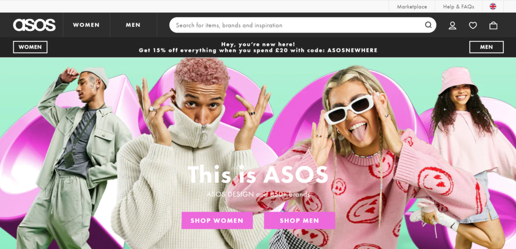
ASOS understand the desire to immediately filter your search – whether you after men’s or women’s clothing. Furthermore, we have an advertisement and exciting imagery, drawing the user in and wanting to spend time browsing the site.
#2 Air BnB
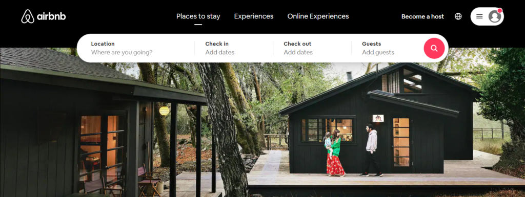
Telling a story – check, call-to-action – check, visually pleasing – check. Air BnB provides a masterclass in website design, and their use of above the fold is seamless.
#3 Netflix
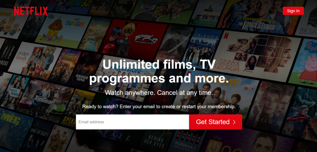
Netflix’s website is very paired back, providing the user with a clear, direct CTA that they almost can’t resist. This compact design outlines how simple website design can sometimes be most effective. However, your website needs to showcase what you do until your build a reputable brand with a name known globally.
Do I need to place all CTA above the fold?
It is a myth that call-to-action needs to appear only above the fold, where to put these actions depends on several factors, but most importantly:
- Certain visitors knowingly entering your site
- Uncertain visitors familiar with your product
- Uncertain visitors that are new to your product, facing a complex proposition
There are certain visitors who have already made their mind up before even visiting your site, and therefore placing a call to action above the fold is a matter of convenience. Perhaps they have spent time researching, or your brand reputation has convinced them to purchase your product or service already.
For uncertain visitors that have some knowledge of your product, a call to action at the top of the page is again, generally best practice and will likely see them through to conversion. However, remember to ensure you provide informative content to persuade the user.
If an uncertain visitor is presented with a complex proposition, such as a product or service that is not obviously beneficial to them, placing the call to action at the top of your page may seem pushy. You need to provide a more in-depth explanation of why the user should convert to a customer.
Simply put, the call to action should be placed in the position in which the visitor is most likely to be persuaded to act upon it.
The takeaway advice
It is clear to see the importance of this high-visibility content, however, it is complex. We should be wary of overloading above the fold and understand your customer’s journey – specifically those that are completely new to your business, as these visitors are far more likely to scroll and want to learn more before converting. A great web design will combine clever techniques with a minimalist approach, inviting the user in to discover what the site has to offer. Balance is key, and it’s vital you work with a design agency that understands how to optimise your website.
Are you looking for a new website design and aren’t sure where to turn? Our expert team of designers here at Delivered Social, are on hand to offer advice and ensure your website is serving your business effectively. Get in touch today at [email protected], we’ll be more than happy to discuss how we can help you.
Enjoyed this blog? Check out:
Share This Article
About the Author: Annabel Britton


