

The Social Cuppa

Spilling the Marketing Tea Across the UK.

The Social Cuppa Logo

Web Design

Marketing Publishing

Overview.

A marketing magazine with the volume turned up.

The Social Cuppa is an online magazine for people who work in marketing, covering social, content, brand, career, tools and AI, plus a Hot Takes section for strong opinions. Articles are written by the women doing the work, so the site needed to feel as bold and chatty as the conversations it was built to host.
  • WordPress CMS: In-house and guest articles can be published, featured and sorted into categories straight from WordPress, with no developer needed.

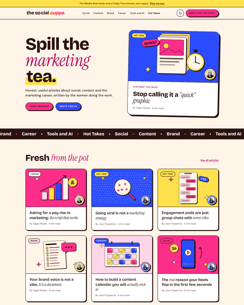
  • A Home for Hot Takes: A bright blue Hot Takes section puts the strongest opinions centre stage, with each one styled like a pull quote.

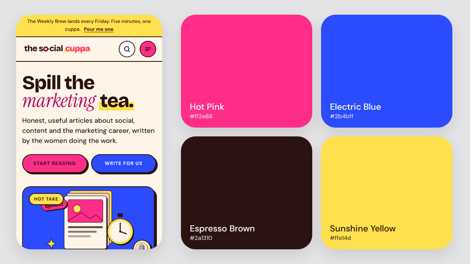
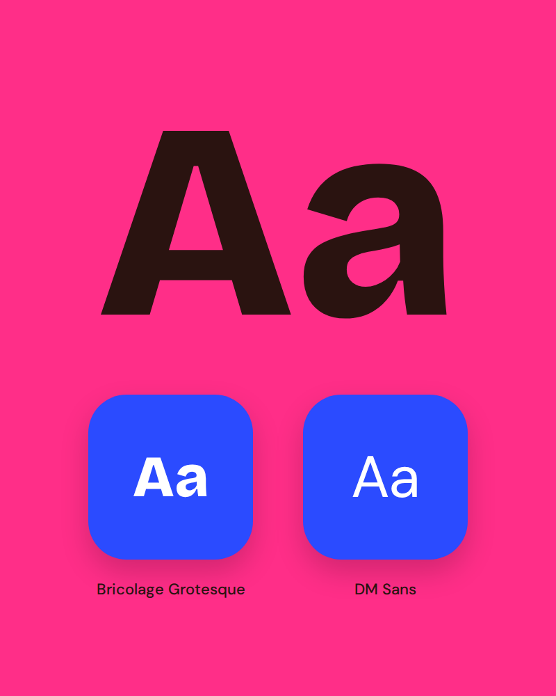
  • Loud, Playful Design: Hot Pink, Electric Blue, Espresso Brown and Sunshine Yellow, with chunky Bricolage Grotesque headings, DM Sans body text and illustrated article cards.

  • Pick Your Brew: Six clear categories, a scrolling topic ticker and a Pick Your Brew panel help readers jump straight to the subject they care about.

  • The Weekly Brew Newsletter: The best marketing reads, one Hot Take and a template to steal every Friday, with sign-up points from the top bar to the footer.

The Social Cuppa Website Homepage

The Challenge.

Being heard in a noisy industry.

Marketing advice is everywhere, and most of it sounds the same. The Social Cuppa needed its own voice from day one: a brand loud enough to stop the scroll, a homepage that puts real writers first, and a simple way for marketers across the UK to pitch their own articles.
  • A Brand With Volume: The design had to feel confident and fun without ever getting in the way of the writing.

  • Putting Writers First: Every article card needed the author’s name and headshot, so readers always know who is talking.

  • A Reason to Come Back Weekly: Readers needed a regular hook, from a featured story of the week to a Friday newsletter.

  • Building a Contributor Community: A clear Write for the Cuppa route was needed so marketers could pitch, with a byline, a link to their work and promotion in return.

The Social Cuppa Colours

The Results.

A magazine that sounds like the people writing it.

The finished site opens with a bold “Spill the marketing tea” hero and a Featured This Week story, followed by Fresh from the Pot, a grid of illustrated article cards with the author’s photo on every one. Hot Takes gets its own bright blue stage, Pick Your Brew lays out the six categories, and Write for the Cuppa explains exactly what contributors get. It all closes with The Weekly Brew sign-up, so every visit ends with a reason to come back.
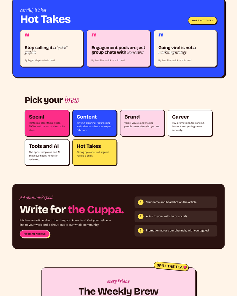
The Social Cuppa Website Sections
The Social Cuppa Typography

We’ve Got More 5* Reviews Than Any Other Digital Marketing Agency in the UK. We’re worth a phone call.