

Keep reading
Rather we just did it for you?
Let's get your business seen.
Social media, websites, SEO and ads from a team you can actually meet.
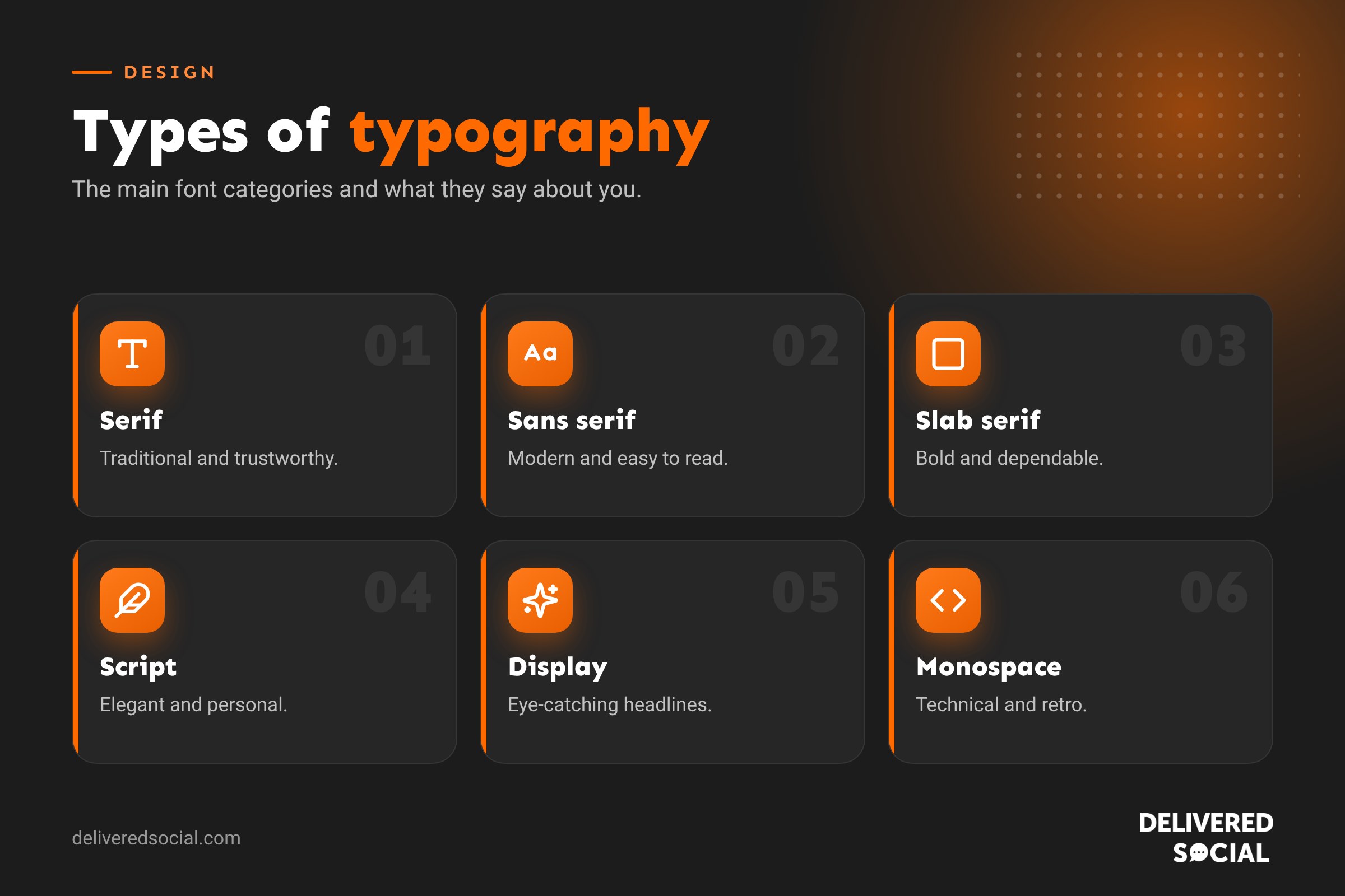
Fonts do more work than most people realise. The same words set in a sturdy serif, a clean sans serif or a flowing script can feel trustworthy, modern or playful. For a business, choosing the right type affects how customers see your brand, how easy your website is to read and even whether people take you seriously. This guide explains the main types of typography and font categories, with examples of each, what they say about a brand, how to pair them and how to choose fonts for your business.
Typography, typefaces and fonts: what’s the difference?
- Typography is the art of arranging type: choosing typefaces, sizes, spacing and layout so text is readable and looks good.
- A typeface is a family of letters with a shared design, such as Helvetica or Garamond.
- A font is a specific style within that family, such as Helvetica Bold or Garamond Italic.
In everyday use, most people say “font” for both, and that’s fine. What matters is understanding the different categories and when to use them.
The main font categories at a glance
| Category | Key feature | Feels | Examples |
|---|---|---|---|
| Serif | Small strokes at the ends of letters | Traditional, trustworthy, established | Times New Roman, Garamond, Georgia, Playfair Display |
| Sans serif | No end strokes, clean lines | Modern, simple, friendly | Helvetica, Arial, Montserrat, Inter, Open Sans |
| Slab serif | Thick, block-like serifs | Bold, confident, sturdy | Rockwell, Roboto Slab, Arvo, Courier |
| Script | Based on handwriting or calligraphy | Elegant, personal, romantic | Great Vibes, Pacifico, Brush Script |
| Display or decorative | Unusual, eye-catching shapes | Creative, attention-grabbing | Lobster, Bebas Neue, Abril Fatface |
| Monospace | Every letter takes the same width | Technical, retro, precise | Courier New, Roboto Mono, Source Code Pro |
| Handwritten | Looks like casual handwriting | Informal, approachable | Caveat, Indie Flower, Patrick Hand |
1. Serif fonts
Serif fonts have small lines, called serifs, at the end of their strokes. They’ve been used in printing for centuries, so they tend to feel traditional, established and trustworthy.
Types of serif fonts
- Old style: soft, rounded serifs and gentle contrast. Examples: Garamond, Caslon.
- Transitional: sharper serifs and more contrast. Examples: Times New Roman, Baskerville, Georgia.
- Modern or Didone: very thin serifs and strong contrast between thick and thin strokes. Examples: Didot, Bodoni, Playfair Display.
Good for: law firms, accountants, financial services, publishers, luxury brands and traditional businesses. Didone fonts are especially popular with fashion and beauty brands.
2. Sans serif fonts
“Sans” means “without”, so sans serif fonts have no serifs. They look clean and modern, and they’re very easy to read on screens. That’s why most websites, apps and tech companies use them.
Types of sans serif fonts
- Grotesque: early sans serifs with slight quirks. Examples: Franklin Gothic, Akzidenz-Grotesk.
- Neo-grotesque: plain and neutral. Examples: Helvetica, Arial, Inter.
- Humanist: based on handwriting shapes, so warmer and friendlier. Examples: Gill Sans, Open Sans, Lato.
- Geometric: built from circles and straight lines. Examples: Futura, Montserrat, Poppins.
Good for: almost any modern business, especially tech, health, retail, hospitality and professional services. Ideal for website body text.
3. Slab serif fonts
Slab serifs have thick, block-shaped serifs. They’re bold and confident, and they work well in headlines and logos.
Good for: trades, construction, automotive, craft breweries, coffee shops and brands that want to feel strong and dependable.
4. Script fonts
Script fonts imitate handwriting or calligraphy. Formal scripts, such as Great Vibes, feel elegant and are often used for weddings and luxury brands. Casual scripts, such as Pacifico, feel relaxed and fun.
Good for: wedding businesses, florists, bakeries, beauty salons and boutique brands. Use them for logos and short headings only, as they’re hard to read in long text.
5. Display and decorative fonts
Display fonts are designed to grab attention at large sizes. They come in every style imaginable: bold condensed capitals such as Bebas Neue, retro styles, stencil fonts and themed fonts.
Good for: logos, posters, event branding and big website headlines. Avoid them for body text.
6. Monospace fonts
In a monospace font, every character takes up the same width, like on a typewriter. They’re used for code and can give designs a technical or retro feel.
Good for: software and tech businesses, creative studios and vintage-style designs.
7. Handwritten fonts
Handwritten fonts look like natural, casual handwriting. They add a personal touch to packaging, social media graphics and menus.
Good for: cafés, children’s businesses, crafts and friendly brands, used sparingly as accents.
What your font says about your brand
| If you want to feel… | Try… |
|---|---|
| Trustworthy and established | A classic serif such as Garamond or Georgia |
| Modern and approachable | A humanist sans serif such as Lato or Open Sans |
| Sleek and design-led | A geometric sans serif such as Montserrat or Futura |
| Luxurious | A Didone serif such as Playfair Display |
| Strong and reliable | A slab serif such as Roboto Slab |
| Personal and warm | A script or handwritten accent |
| Bold and loud | A display font such as Bebas Neue |
How to pair fonts
Most brands use two fonts: one for headings and one for body text. A few rules make pairing easy:
- Contrast works. Pair a serif heading with a sans serif body, or the other way round.
- Keep to two, or three at most. More looks messy.
- Use weights for variety. One family with regular, medium and bold styles can do a lot.
- Match the mood. Both fonts should suit the same personality.
Font pairings that work well
| Headings | Body text | Feel |
|---|---|---|
| Playfair Display | Lato | Elegant and readable |
| Montserrat | Open Sans | Clean and modern |
| Roboto Slab | Roboto | Strong and consistent |
| Bebas Neue | Inter | Bold and contemporary |
| Merriweather | Source Sans | Friendly and professional |
Typography terms worth knowing
- Weight: how thick the letters are, from thin to black.
- Kerning: the space between two specific letters.
- Tracking: the overall spacing across a word or line.
- Leading (line height): the space between lines of text.
- x-height: the height of lower-case letters. A large x-height is easier to read on screens.
- Hierarchy: using size, weight and colour to show what’s most important.
Typography tips for your website
- Use body text of at least 16 pixels so it’s easy to read on phones.
- Set line height to around 1.5 times the font size.
- Keep lines to roughly 50 to 75 characters on desktop.
- Make sure text contrasts strongly with the background for accessibility.
- Limit the number of font files to keep your website fast.
- Use web fonts, such as Google Fonts, so text looks the same on every device.
- Avoid all capitals for long text, as it’s harder to read.
How to choose fonts for your business
- Define your brand personality. Pick three words, such as “friendly, local, reliable”.
- Look at your competitors and decide whether to fit in or stand out.
- Choose a heading font that reflects your personality.
- Choose a readable body font that pairs well.
- Test everywhere: on your website, on a phone, in a social media graphic, on a business card and on signage.
- Check the licence. Make sure you’re allowed to use the font commercially. Google Fonts are free for business use.
- Write it down in your brand guidelines so everyone uses the same fonts.
For more help, read our guides to choosing brand fonts and brand guidelines.
Common typography mistakes
- Using too many different fonts.
- Using script or display fonts for paragraphs.
- Text that’s too small or too light to read.
- Poor contrast, such as grey text on a white background.
- Inconsistent fonts across your website, social media and print.
- Stretching or squashing fonts.
Typography on social media
Your fonts should carry across from your website to your social media. Use your brand fonts in Canva templates for carousels, quote graphics and Story covers, so every post is instantly recognisable. Keep text short and large on social graphics, because people view them on small screens while scrolling. A bold sans serif for headlines and a simple, readable font for any extra text usually works best. Avoid thin script fonts on busy photos, where they quickly become unreadable. Saving your fonts and colours as a brand kit in your design tool means anyone in your team can create on-brand graphics in minutes.
Frequently asked questions
What are the main types of typography?
The main font categories are serif, sans serif, slab serif, script, display, monospace and handwritten.
What is the most readable font type?
Clean sans serif fonts such as Open Sans, Lato and Inter are among the most readable on screens. Serif fonts such as Georgia also read well.
What’s the difference between a font and a typeface?
A typeface is the overall design family, while a font is a specific style within it, such as bold or italic.
How many fonts should a brand use?
Two is ideal: one for headings and one for body text.
Are Google Fonts free for business use?
Yes. Google Fonts are open source and free for commercial use.
Want a website with typography that works?
We design websites and brands for businesses across Surrey, Hampshire and the UK, with fonts chosen to suit your brand and read perfectly on every device. See our website design services or call us on 01483 608 303.