



Keep reading
Rather we just did it for you?
Let's get your business seen.
Social media, websites, SEO and ads from a team you can actually meet.
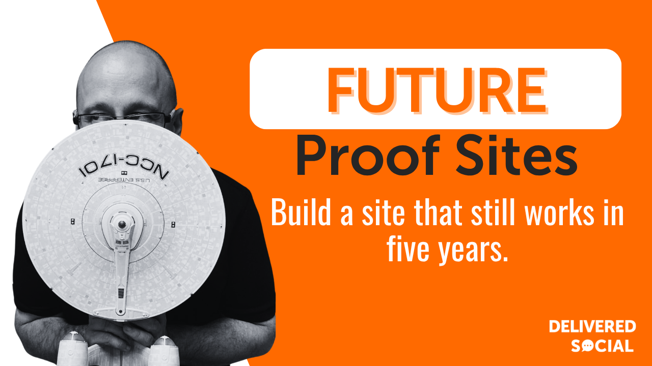
Every few years a website starts to feel tired. Not broken exactly; just slightly behind, like a shop still using last season’s window display. If you run a technology business that feeling arrives faster than it does for anyone else, because your audience quietly judges your credibility on whether your own site looks like it was built by people who understand the web. Strong technology web design is the antidote: a site built so it can grow, adapt and stay fast without being torn down every eighteen months. We say this to clients all the time; you are not buying a website, you are buying the next five years of one.
Technology web design is really about staying understandable
There is a myth that a tech company’s website should look complicated, as though complexity were proof of capability. In practice the opposite is true. The sites that win work are the ones that take something genuinely intricate and make a busy human understand it in about eight seconds.
So when we talk about technology web design, we mean design that carries three jobs at once. It has to explain a product that may be abstract; it has to reassure a visitor that you are a real, credible business; and it has to keep working when your product changes, which for a tech company is roughly always. That last part is where future-proofing lives.
A future-proof site is not one that never changes. It is one where change is cheap.

Why a future-proof site pays for itself
Rebuilds are expensive, and not only in invoices. The real cost is the three months where nobody updates anything because the site is mid-surgery, and the leads you did not chase because the contact form was broken on mobile.
Here is what a well-built, adaptable site actually buys you:
- Lower long-term cost: adding a new product page should take an afternoon, not a development sprint and a quote.
- Better search performance: search engines reward sites that are fast, secure and consistently updated, and a site you can update easily is a site you will actually update.
- Faster launches: when your team ships a new feature, marketing should not be the bottleneck.
- Higher trust: an up-to-date site with real case studies and a working contact route converts better than a beautiful one that has not been touched since 2023.
- Less key-person risk: if only one freelancer understands how your site works, you do not own a website; you own a dependency.
How to build a tech website that lasts
You do not need to get everything right on day one. You do need to make a handful of structural decisions properly, because those are the ones that are painful to reverse later.
Start with the questions your buyers actually ask
Before anyone opens a design tool, write down the ten questions your sales team answers every week. What does it do? Who is it for? What does it cost? Who else uses it? How do I get started? Those questions are your sitemap. Most tech sites fail because they were structured around the company’s internal org chart rather than the customer’s confusion.
Choose a platform you can live with
Pick the content management system your team can genuinely operate. A beautifully engineered custom build that only a developer can edit will quietly go stale; a well-configured site integrated with your team’s AI project management workflows so a marketing coordinator can update it on a Tuesday afternoon will stay alive.
Build in components, not pages
This is the single biggest future-proofing decision. Instead of designing forty individual pages, design a kit of reusable blocks: a hero, a feature grid, a testimonial, a pricing panel, a call-to-action strip. New pages then become assembly rather than construction, and your site stays visually consistent even when five different people have added to it.
Design mobile-first and prove it
More than half your visitors will arrive on a phone, and for a tech audience checking you out between meetings that share climbs higher. Design the small screen first, then let it grow, rather than squashing a desktop layout down and hoping.
Get the technical foundations in place early
Decent hosting, an SSL certificate, sensible URL structure, compressed images, a caching layer and analytics that someone actually looks at. None of it is glamorous. All of it is the difference between a site that ranks and a site that merely exists.
Write it before you polish it
Design around real copy, real screenshots and real customer names. Placeholder text hides problems; the moment you drop in the actual paragraph and it runs to nine lines, you learn something about your layout.
Template, page builder or custom build: how to choose
There is no universally right answer here, only the right answer for your stage and your team. Broadly:
- Off-the-shelf template: cheapest and quickest, and perfectly respectable for an early-stage business that needs credibility fast. The limit is that you will eventually want something it cannot do, and you will feel that wall arrive.
- Page builder on a solid CMS: the sweet spot for most small and medium tech firms. Your team can edit without touching code, the component approach works naturally, and you can extend it as you grow. It does need someone to keep plugins tidy and up-to-date.
- Fully custom build: the most control, the best performance ceiling and the highest cost. It genuinely makes sense when your site is part of your product, or when you have unusual integrations. It is overkill when you mainly need to explain what you sell.
- Headless setup: excellent if you are publishing the same content to a site, an app and a documentation portal. Real flexibility, real complexity; do not choose it for a five-page brochure site.
Our honest rule of thumb: choose the simplest option that will still be right in two years, not the most impressive option available today.
Best practices we come back to again and again
These are the habits that separate sites that age well from sites that age badly.
- Keep one clear next step per page: every page should make it obvious what to do next, whether that is booking a demo, reading a case study or getting in touch.
- Treat speed as a design constraint: a gorgeous hero video that adds four seconds to load time is not a gorgeous hero video, it is a bounce.
- Use plain English: your engineers may love the phrase “orchestration layer”, but your buyer’s finance director does not. Write the sentence you would say out loud.
- Show proof, not adjectives: logos, numbers you can stand behind, named testimonials and screenshots beat another round of “innovative, scalable, cutting-edge”.
- Make accessibility a default: proper contrast, real text rather than text baked into images, sensible heading order and keyboard-navigable menus. It widens your audience and it happens to be good for search too.
- Document the thing: a one-page note explaining where the site is hosted, who owns the domain and how to update the header will save you a very bad afternoon one day.
The mistakes that age a tech site fastest
We see the same handful repeatedly, and they are all avoidable.
The first is designing for a launch rather than for a lifetime; the site looks magnificent in week one and nobody has any idea how to add the second product line. The second is plugin sprawl, where a site quietly accumulates twenty-eight plugins, six of which have not been updated in two years and one of which will eventually become a security problem.
Then there is the stock-photo trap: rows of identical handshake images that make a distinctive company look like every other company. There is also the abandoned blog, still proudly displaying a post from three years ago, which tells visitors more about your business than you would like.
Finally, and most costly, is ignoring measurement. If nobody has looked at which pages actually generate enquiries, then every redesign is guesswork with a nicer colour palette.
Where technology web design is heading next
A few directions look reasonably safe to plan around. Performance and Core Web Vitals continue to matter, so lightweight, well-optimised builds keep their advantage. Accessibility expectations keep rising, and regulation in several markets is moving the same way, so building it in now is cheaper than retrofitting later.
Content is increasingly read by machines as well as people, whether that is a search engine, an AI assistant summarising your service or a procurement tool scraping your pricing page. Clear structure, sensible headings and genuinely informative copy help with all three. Meanwhile personalisation and interactive product tours are becoming normal rather than novel, and privacy-first analytics is steadily replacing the older tracking-everything approach.
None of this changes the fundamentals. Fast, clear, credible and easy to update will still be the brief in five years.
How often should a technology website be redesigned?
If it is built well, you should be refreshing rather than redesigning. Plan a meaningful content and design review every twelve to eighteen months, and a genuine rebuild only when your business model, brand or platform has fundamentally changed. Constant small improvements beat a dramatic relaunch every four years. For more on this, read Web Design for Tech Companies: Building a Future-Proof Site.
Do tech companies really need a blog?
You need somewhere to demonstrate expertise and answer buyer questions in your own words, and a blog is usually the simplest version of that. What matters is consistency and usefulness rather than volume; twelve genuinely helpful posts a year will do more than sixty thin ones.
What makes a website slow, and does it actually matter?
Usually oversized images, too many scripts, cheap hosting and bloated page builders, roughly in that order. And yes, it matters. Slow sites lose visitors before the page has finished drawing, and search engines factor speed into rankings, so it costs you twice.
Should we build our website in-house or use an agency?
If you have designers and front-end developers with spare capacity and a real interest in marketing, in-house can work well. Most tech SMEs find that their technical people are, quite reasonably, busy building the product, and the website ends up perpetually eighty per cent finished. An agency mainly buys you the thing actually getting done.
Your future-proofing checklist
Run through this before you sign off any new build:
- Structure: does the sitemap answer real buyer questions rather than mirror your org chart?
- Components: can a new page be assembled from existing blocks without a developer?
- Editing: can a non-technical colleague update copy, images and a call to action unaided?
- Mobile: have you tested the key journeys on an actual phone, not just a resized browser window?
- Speed: are images compressed and does the homepage load quickly on a mediocre connection?
- Security: is SSL active, are backups automatic and is someone responsible for updates?
- Measurement: is analytics installed, and does one named person look at it monthly?
- Ownership: do you control your domain, hosting and CMS logins, in your own accounts?
- Content plan: is there a realistic plan for what gets added in the first six months after launch?
Contact us
If your site is starting to feel like it is holding the business back, it probably is, and it rarely gets better on its own. Good technology web design should make your next five years easier, not lock you into a layout you already regret. At Delivered Social we build websites for small and growing businesses across the UK, and we are just as happy improving what you have as starting fresh. Pop in for a chat, book a call, or come along to one of our free Delivered Social Socials and bring your questions; we will give you a straight answer either way.































