

Keep reading
Rather we just did it for you?
Let's get your business seen.
Social media, websites, SEO and ads from a team you can actually meet.
Web design moves quickly, and a website that looked fresh three years ago can already feel dated. But not every trend is worth chasing. Some make websites faster, clearer and better at bringing in customers; others are just fashion. This guide covers the web design trends for 2026 that matter for small and medium businesses, what each one means in practice, which to embrace and which to avoid, and how to tell if your own website needs a refresh.
1. Bold, oversized typography
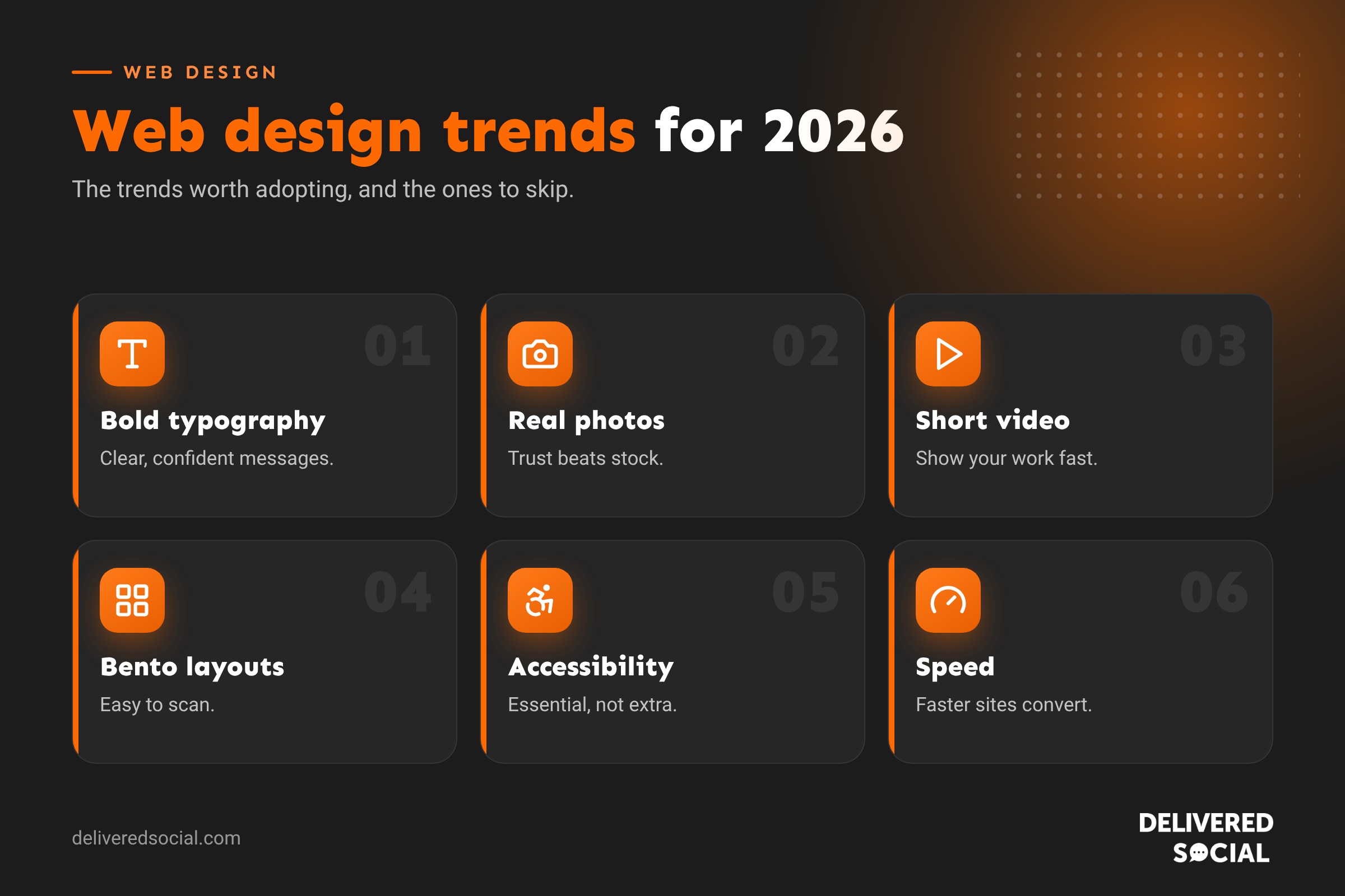
Big, confident headlines are everywhere. Large type grabs attention, works well on mobile and makes your main message impossible to miss. Pair a strong headline font with a clean, readable body font, and keep body text large enough to read comfortably on a phone.
Use it if: you have a clear, punchy message. Avoid: giant text that pushes everything useful below the fold.
2. Authentic photography over stock
Visitors are tired of generic stock photos and obviously AI-generated images. Real photos of your team, premises, products and customers build trust far faster. Behind-the-scenes shots and short videos give personality that templates can’t.
3. Short video and motion
Short background videos, product clips and subtle animations make websites feel alive. Used well, they show your work in seconds. Used badly, they slow pages down and distract.
- Keep videos short and compressed.
- Don’t autoplay sound.
- Respect users who’ve asked their device to reduce motion.
4. Bento grid layouts
Bento layouts arrange content in neat boxes of different sizes, like a Japanese lunch box. They’re great for showing features, services or stats at a glance, and they adapt nicely to mobile by stacking.
5. Dark mode and rich colour
Dark designs and dark mode options remain popular, alongside bold brand colours and gradients. Colour helps you stand out, but contrast matters: text must stay easy to read for everyone.
6. Accessibility as standard
Accessible design is no longer optional. It means clear contrast, readable fonts, descriptive link text, alt text on images, keyboard-friendly navigation and forms that work with screen readers. It helps disabled visitors, older visitors and anyone browsing on the go, and it’s good for SEO too.
7. Speed and performance
Fast websites convert better and rank better. Expect more focus on lightweight themes, modern image formats, lazy loading, caching and fewer heavy plugins. Google’s Core Web Vitals measure loading, responsiveness and layout stability, and good scores are a sign of a well-built site. Our guide on clearing WordPress cache touches on how caching helps speed.
8. AI-powered features
AI is appearing on websites as smarter search, chat assistants, personalised recommendations and quote tools. For small businesses, the most useful AI features answer common questions instantly or help visitors find the right service. Keep a human option available and check AI answers are accurate.
9. Clear, conversion-focused layouts
The best-performing sites make the next step obvious. Expect:
- One clear call to action per section.
- Sticky call or book buttons on mobile.
- Reviews and trust badges near key buttons.
- Short forms with only essential fields.
- Pricing or “from” prices where possible, so visitors self-qualify.
10. Content built for search and AI answers
Websites are being structured to answer questions clearly, with helpful headings, FAQs, comparison tables and concise summaries. This helps visitors, Google and AI search tools understand and use your content.
11. Micro-interactions
Small touches like buttons that respond when pressed, smooth menu transitions and subtle hover effects make sites feel polished. Keep them quick and purposeful.
12. Sustainable web design
Lighter pages use less energy. Sustainable design means optimised images, efficient code, fewer third-party scripts and green hosting. It’s good for the planet and usually makes sites faster too.
Trends at a glance
| Trend | Business benefit | Worth adopting? |
|---|---|---|
| Bold typography | Clear messages, strong first impression | Yes |
| Authentic photography | Trust and personality | Yes |
| Short video | Shows work quickly | Yes, if optimised |
| Bento layouts | Easy scanning | Yes, for features and services |
| Accessibility | Reaches everyone, supports SEO | Essential |
| Speed focus | More enquiries and better rankings | Essential |
| AI chat and search | Faster answers | Sometimes |
| Heavy 3D and effects | Wow factor | Rarely for small businesses |
Trends to be careful with
- Heavy 3D and complex animations: impressive but often slow, especially on mobile.
- Hidden navigation on desktop: visitors shouldn’t have to hunt for your menu.
- Low-contrast minimalism: pale grey text on white looks stylish but is hard to read.
- Scroll-jacking: overriding normal scrolling frustrates users.
- Pop-ups everywhere: they interrupt visitors and can hurt mobile SEO.
Signs your website needs a refresh
- It’s slow or awkward on mobile.
- It looks dated next to competitors.
- Photos are mostly stock images.
- Visitors can’t quickly see what you do and where.
- It’s hard to update yourself.
- It brings in fewer enquiries than it used to.
Redesign or refresh?
Not every website needs a full rebuild. A refresh might mean new photography, updated copy, a cleaner homepage, faster hosting and better calls to action. A full redesign makes sense when the structure, platform or brand no longer fits the business. If you’re on WordPress, both are usually possible without losing your content. Read is WordPress still relevant in 2026 if you’re weighing up platforms.
How to use trends without dating your site
- Start with your customers, not the trend.
- Keep foundations timeless: clear structure, readable text, fast pages.
- Add trends in layers that are easy to update later, like imagery and colour.
- Test on real phones before launch.
- Measure results after changes: enquiries, bounce rate and time on page.
Web design and your brand
Trends should support your brand, not replace it. A solicitor’s website should feel trustworthy and calm; a children’s play centre can be bright and playful. Use the trends that fit your personality and audience, and ignore the rest. Consistency across your website, social media and printed materials matters more than following every new style.
Mobile-first design
Most small business websites now get the majority of visits from phones. Mobile-first design means planning the phone version first: thumb-friendly buttons, readable text without zooming, short forms, click-to-call numbers and menus that are easy to open and close. Desktop layouts are then expanded from that solid base, rather than squeezing a desktop design onto a small screen.
Personal, human brands
Another strong trend is putting people at the centre. “Meet the team” sections, founder stories, handwritten touches and real customer stories help small businesses stand out from faceless competitors and AI-generated sites. People buy from people, especially locally, so showing who’s behind the business is one of the simplest ways to build trust.
Trust signals front and centre
Expect to see Google review scores, accreditations, case studies and guarantees placed near the top of pages and close to buttons, rather than hidden on a separate testimonials page. Visitors decide quickly whether to trust you, so make the proof easy to find.
Quick glossary
- Bento grid: a layout of boxes in different sizes.
- Core Web Vitals: Google’s measures of page speed and stability.
- Micro-interaction: a small visual response to a user action.
- Above the fold: the part of a page visible without scrolling.
- Accessibility: designing so everyone can use your website.
Questions to ask before a redesign
- What do we want visitors to do on the website?
- Which pages bring in the most enquiries today?
- What do customers ask before they buy?
- Which competitor sites do we admire, and why?
- How will we measure whether the new site is better?
Answering these first keeps a redesign focused on results rather than looks alone.
A good designer will ask these questions too, and help you decide which trends genuinely suit your business.
Key takeaways
- The best 2026 trends make websites clearer, faster and more trustworthy.
- Authentic photos, bold type and short video help you stand out.
- Accessibility and speed are essentials, not extras.
- Be careful with heavy effects that slow pages down.
- Choose trends that suit your brand and customers.
Frequently asked questions
What are the biggest web design trends for 2026?
Bold typography, authentic photography, short video, bento layouts, accessibility, speed and useful AI features.
How often should I redesign my website?
Many businesses refresh every two to four years, with smaller updates in between.
Do web design trends affect SEO?
Speed, mobile usability and accessibility do. Purely visual trends have less direct impact.
Should I add an AI chatbot to my website?
Only if it answers questions accurately and offers an easy way to reach a person.
Is minimalist design still popular?
Yes, but with bolder type and colour, and better contrast than before.
Are AI-generated images okay on a business website?
Sparingly, for illustrations. Real photos of your team, work and premises build far more trust.
What colours are popular in web design?
Bold brand colours, rich darks and soft gradients, always with strong contrast for readability.
Do I need video on my website?
It helps, especially to show your work, but keep it short and fast to load.
Want a website that feels current and converts?
We design WordPress websites for businesses across Surrey, Hampshire and the UK. Call us on 01483 608 303 to talk about a refresh or redesign.