

Keep reading
Rather we just did it for you?
Let's get your business seen.
Social media, websites, SEO and ads from a team you can actually meet.
Whether you’re planning a new website or refreshing an old one, it’s easy to get stuck staring at a blank page or a dated design, unsure where to start. The best website designs aren’t just pretty: they make it obvious what you do, build trust quickly and guide visitors to take action. This guide shares practical website design ideas for small businesses, charities and personal brands, from hero sections and navigation to colour, imagery, social proof and calls to action, plus ideas by industry and how to choose what’s right for you.
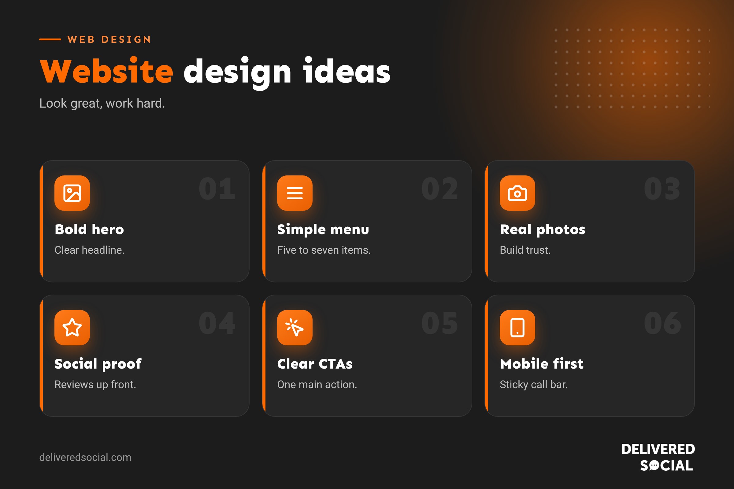
Start with your goal
Before collecting ideas, decide what the website must do. More enquiries? Online sales? Bookings? Donations? Recruitment? Every design idea should support that goal. A beautiful site that doesn’t convert isn’t a good design.
Hero section ideas
The hero section, the first thing visitors see, has a few seconds to make an impression.
- Clear headline: say what you do and for whom, such as “Wedding photography across Surrey and Hampshire”.
- Supporting line: the main benefit or what makes you different.
- Strong call to action: one main button, such as “Book a free consultation”.
- Real imagery: a photo of you, your team, your premises or your work.
- Short video background: a subtle, silent clip of your work in action.
- Trust strip: star rating, client logos or accreditations right below.
Navigation ideas
- Keep main menus to around five to seven items.
- Use plain labels like “Services”, “Pricing”, “About”, “Contact”.
- Add a sticky header with phone number and main button.
- Use mega menus only if you have many services or products.
- On mobile, make the menu and call button easy to reach with a thumb.
Layout ideas
- Alternating sections: text and images swapping sides keep long pages interesting.
- Bento grids: varied boxes showing services, stats and highlights.
- Card layouts: tidy grids for services, team members or case studies.
- Single-column storytelling: great for charities and personal brands.
- Generous white space: makes pages feel premium and readable.
See our round-up of web design trends for current styles.
Colour ideas
- Build your palette from your logo and brand.
- Use one bold accent colour for buttons and highlights.
- Try a dark mode or dark sections for a modern, premium feel.
- Use soft background tints to separate sections.
- Check contrast for accessibility.
Typography ideas
- Pair a characterful heading font with a clean body font.
- Use large, confident headlines.
- Keep body text readable at 16 pixels or more.
- Use bold short phrases to make pages scannable.
Imagery ideas
- Professional photos of your team, premises and products.
- Behind-the-scenes shots of your process.
- Before-and-after comparisons for trades, beauty and design.
- Custom illustrations for a distinctive brand look.
- Short looping videos or GIFs to show products in use.
- Infographics to explain processes.
Social proof ideas
- Google review widgets or star ratings.
- Video testimonials from real clients.
- Case studies with results and photos.
- Client logos and accreditations.
- Numbers: years in business, projects completed, customers served.
- Awards and press mentions.
Call to action ideas
- One primary action per page, repeated at natural points.
- Specific wording: “Get a free quote” beats “Submit”.
- Low-commitment options: “Book a 15-minute call” or “Download the price guide”.
- Sticky mobile call and WhatsApp buttons.
- Short forms with only essential fields.
Interactive ideas
- Price calculators or quote estimators.
- Quizzes that recommend a product or service.
- Before-and-after sliders.
- Interactive maps of areas covered.
- Booking calendars.
- Subtle scroll animations that reveal content.
Use interactivity sparingly; it should help users, not slow them down.
Ideas by industry
| Industry | Design ideas |
|---|---|
| Trades | Before-and-after galleries, reviews up front, sticky call button, areas covered map |
| Restaurants and cafés | Mouth-watering photos, menu highlights, booking button, opening times above the fold |
| Professional services | Clear service pages, team profiles, case studies, booking a consultation |
| Health and beauty | Calm palettes, treatment menus, online booking, practitioner bios |
| Charities | Impact stories, donation buttons, volunteer sign-ups, clear impact numbers |
| Online shops | Big product photos, filters, reviews, clear delivery information |
| Personal brands | Strong portrait photography, story-led layout, speaking and media sections |
See our guides on nonprofit website design ideas and ecommerce website examples for more inspiration.
Small page ideas that make a big difference
- About page: real story, photos and values.
- Pricing page: clear packages or “from” prices to qualify enquiries.
- FAQ page: answer common questions and objections.
- Creative 404 page: turn errors into a friendly moment. See creative 404 pages.
- Thank-you page: explain what happens next and share useful links.
Where to find more inspiration
- Competitors and businesses you admire, in and outside your industry.
- Design galleries and award sites.
- Theme and template libraries.
- Social media platforms where designers share work.
- Your own customers: ask what they want to find quickly.
Collect screenshots, then note why each idea works. Combine principles rather than copying designs.
How to choose the right ideas
- Does it support the website’s main goal?
- Does it fit your brand and audience?
- Will it work well on mobile?
- Will it keep the site fast?
- Is it accessible?
- Can you maintain it, such as keeping a blog or case studies updated?
Design ideas to avoid
- Auto-playing sliders with lots of messages.
- Pop-ups that appear instantly.
- Walls of text with no headings.
- Stock photos that look generic.
- Hidden contact details.
- Heavy animations that slow the site.
Turning ideas into a website
Once you have a shortlist, sketch a simple layout for your home page and main service page, then build or brief a designer. Our guides to web design for beginners and getting a web design quote will help.
Example: a dated site refreshed
A family-run garden centre had a website with a large rotating slider, tiny text and contact details hidden at the bottom. The redesign replaced the slider with a single hero photo of the shop in spring, a clear headline and an “Opening times and directions” button. Seasonal offers moved into tidy cards, Google reviews appeared below the hero, and a sticky mobile bar added call and directions buttons. The site felt brighter and simpler, and visits to the directions page rose noticeably in the first month.
Accessibility ideas that improve design
- High contrast between text and backgrounds.
- Large, clearly labelled buttons.
- Descriptive link text instead of “click here”.
- Captions on videos.
- Logical heading order.
- Visible focus styles for keyboard users.
Accessible design is good design: it makes your site easier for everyone to use.
Mobile-first design ideas
- A sticky bottom bar with call, book and directions buttons.
- Short, scannable sections with plenty of space.
- Collapsible FAQs to keep pages tidy.
- Thumb-friendly buttons and form fields.
- Images cropped for portrait screens.
Quick glossary
- Hero section: the large opening area of a page.
- Above the fold: what’s visible before scrolling.
- Bento grid: a layout of varied boxes, like a bento box.
- Social proof: reviews and evidence that build trust.
- Sticky header: a header that stays visible while scrolling.
Key takeaways
- Start with the website’s goal, then choose ideas that support it.
- Strong heroes, real photos and social proof build trust fast.
- Keep navigation simple and calls to action clear.
- Tailor ideas to your industry and audience.
- Prioritise mobile, speed and accessibility.
Frequently asked questions
What makes a good website design?
Clear messaging, easy navigation, trust signals, strong calls to action and fast, mobile-friendly pages.
How do I get website design ideas?
Look at competitors, design galleries and sites you like, then note why they work.
Should I copy a website I like?
No. Borrow principles, not designs or content.
What should be on a home page?
A clear headline, key services, proof, a call to action and contact details.
Are sliders a good idea?
Usually not; a single strong message works better.
How many colours should a website use?
Typically a primary colour, one or two secondary colours and neutrals.
Should I use stock photos?
Sparingly. Real photos of your business build more trust.
How often should I redesign my website?
Many businesses refresh every three to five years, with small updates in between.
What is above the fold?
The part of a page visible before scrolling, where your key message belongs.
Should my website have a blog?
If you can keep it updated with helpful articles, yes; it supports SEO and trust.
Do I need a pricing page?
Showing prices, even “from” prices, helps qualify enquiries and builds trust.
How important are reviews on a website?
Very. Reviews are one of the strongest trust signals for new visitors.
What makes a good call to action?
Specific, action-focused wording and a button that stands out from the page.
Should I use dark mode?
Dark sections can look modern and premium, but keep text readable with strong contrast.
How many pages does a small business website need?
Often five to ten: home, services, about, reviews or case studies, pricing, FAQs and contact.
Can I use animations?
Subtle ones, yes. Avoid anything that slows pages or distracts from your message.
Where should my phone number go?
In the header, footer and contact page, and as a tap-to-call button on mobile.
Want a website that looks great and works hard?
We design and build websites for businesses across Surrey, Hampshire and the UK. Call us on 01483 608 303.